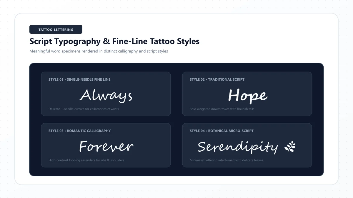
A name written in elegant cursive. A meaningful word in delicate handwriting. A short quote that curves naturally along your arm.
Script tattoos can make a few letters feel deeply personal.
But choosing the right cursive font for a tattoo involves more than finding a beautiful typeface on your phone. The same tiny loops and delicate lines that look gorgeous on a screen may be difficult to reproduce clearly on skin—especially when the design is small.
That's why it's worth comparing different styles before settling on the final lettering.
In this guide, you'll discover 30 of the best cursive fonts for tattoos, including elegant calligraphy, romantic handwritten scripts, minimalist lettering, and bolder retro styles.
You'll also learn which characteristics matter for name tattoos, meaningful quotes, memorial lettering, and different body placements, plus how to preview your text and work with a tattoo artist to create a readable design.
What Is the Best Cursive Font for a Tattoo?
The best cursive tattoo font is one that suits your chosen words, remains readable at the intended size, and gives your tattoo artist enough room to reproduce its details clearly.
Some fonts look graceful because of very thin connecting strokes. Others are more prominent, with broader lettering and open curves.
Neither approach is automatically right for every tattoo.
Before choosing a font, consider these five questions:
- Can you read every letter? Decorative capitals and tight connections shouldn't make the word ambiguous.
- Are the strokes substantial enough? Extremely delicate hairlines may need adjustment.
- Is there enough spacing? Small enclosed spaces in letters such as a, e, and o should remain open.
- Does the font fit the words? A single name may suit a more elaborate style than a long quotation.
- Can the design be adapted to the placement? Your artist needs to assess size, curves, movement, and the condition of the skin.
A font preview is a starting point. The final tattoo should be drawn or adjusted for your body by a qualified artist.
30 Best Cursive Tattoo Fonts at a Glance
We've grouped the fonts into four practical categories.
Style category | Fonts | Best for |
|---|---|---|
Elegant and romantic scripts | 1–10 | Names, memorial words, meaningful dates |
Simple and handwritten scripts | 11–20 | Personal handwriting, casual phrases, relaxed lettering |
Bold and expressive scripts | 21–30 | Statement words, vintage styles, larger lettering |
The descriptions below refer to visual characteristics of typefaces—not guarantees about how a tattoo will age.
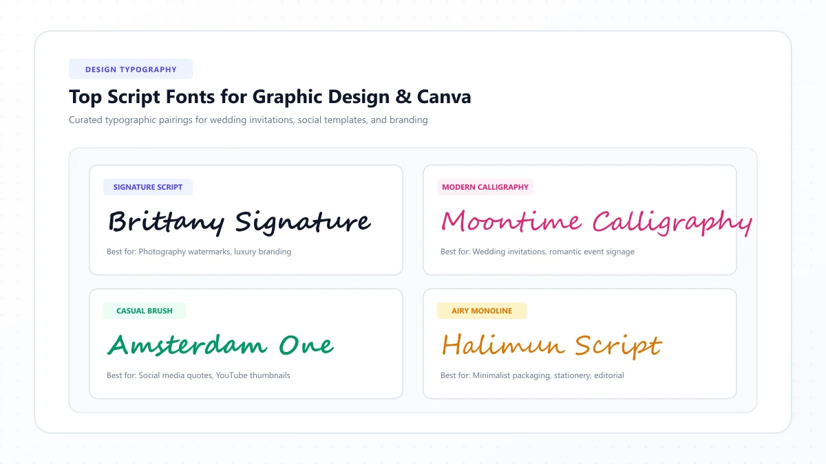
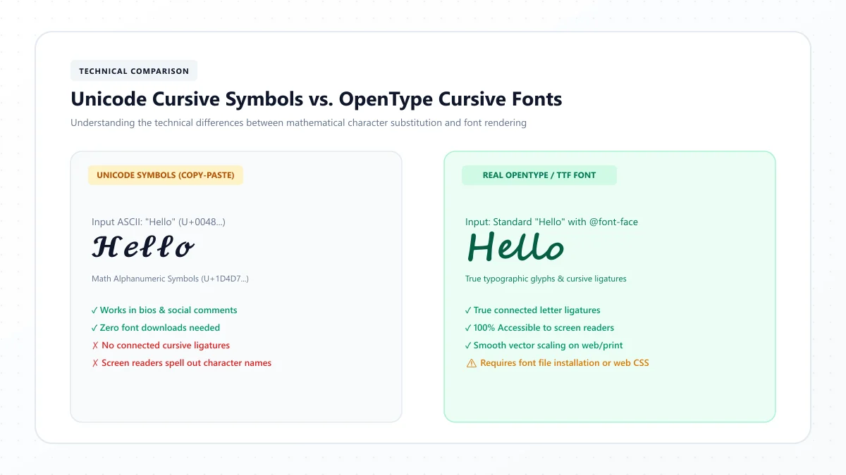
Font files, Unicode decorative characters, and traditional calligraphy styles are different things. The names in this collection identify actual font families that you can look up and compare.
1. Great Vibes — Elegant Formal Cursive
Best for: Names, wedding-inspired lettering, sentimental words.
Great Vibes has dramatic capital letters, flowing connections, and a refined calligraphic appearance.
It's a natural reference for romantic names or short phrases with a formal feel.
Its elaborate entry and exit strokes can become crowded if the tattoo is too small, so the final design may need simplified capitals and more space between letters.
Try these words: Forever, Amelia, Beloved.
Design tip: Let one capital be the focal point instead of adding flourishes to every letter.
2. Allura — Soft Signature-Style Script
Best for: A loved one's name, short personal messages, understated elegant lettering.
Allura has gentle handwritten movement and graceful curves.
It feels more relaxed than some highly formal calligraphy fonts while still looking polished.
The relatively delicate connecting strokes deserve attention during tattoo design.
Try these words: Always, Grace, Olivia.
Design tip: Ask your artist to review the thinnest connections and small enclosed spaces.
3. Alex Brush — Expressive Brush Lettering
Best for: Short phrases, names, artistic lettering.
Alex Brush combines energetic curves with the visual character of brush-written script.
It creates a lively, personal impression without necessarily requiring a complicated decorative frame.
Certain loops and overlapping strokes may need adjustment to remain clear at the proposed size.
Try these words: Believe, Dream, Isabella.
Design tip: Compare the word both with and without extended flourishes.
4. Pinyon Script — Classic Formal Penmanship
Best for: Vintage-inspired names, formal initials, elegant inscriptions.
Pinyon Script takes inspiration from traditional formal handwriting.
Its structured slant and refined proportions produce a timeless appearance.
However, its thin detailing and graceful connections can become difficult to distinguish when compressed.
Try these words: Eleanor, Remember, Forever.
Design tip: Use enough room for capitals and avoid squeezing a long phrase into a narrow area.
5. Parisienne — Romantic Modern Script
Best for: Short romantic phrases, personal names, delicate typography.
Parisienne has fluid connections and a light, friendly elegance.
It feels decorative without being as formal as some historical penmanship-inspired typefaces.
A simple name can show off its personality better than a densely packed sentence.
Try these words: Amour, Sophia, Cherish.
Design tip: Review capital letters separately to ensure the opening character is immediately recognizable.
6. Petit Formal Script — Refined, Restrained Calligraphy
Best for: Classic short inscriptions and more formal lettering.
Petit Formal Script offers controlled calligraphic shapes and a distinctive, orderly rhythm.
It's useful for someone who prefers traditional elegance over oversized swashes.
The refined shapes still require appropriate spacing and stroke adjustments.
Try these words: Hope, Victoria, Eternal.
Design tip: Keep the layout simple and allow the letterforms to stand on their own.
7. Tangerine — Delicate, Airy Script
Best for: Large, graceful designs with a light visual feel.
Tangerine is recognized for its thin, elegant strokes and flowing capital shapes.
It looks beautiful in typography previews, but its delicate structure makes it a more demanding tattoo reference.
A tattoo artist may need to enlarge the design, strengthen the strokes, or simplify the letterforms considerably.
Try these words: Serenity, Faith, Grace.
Design tip: Avoid assuming that a tiny digital preview can be tattooed at exactly the same proportions.
8. Italianno — Dramatic Flowing Calligraphy
Best for: Statement names and decorative short phrases.
Italianno uses sweeping, elegant movements and expressive letterforms.
It offers a romantic appearance, particularly in larger words where the curves have room to breathe.
Its decorative strokes can overlap visually, so spacing is essential.
Try these words: Destiny, Beautiful, Evermore.
Design tip: Preview the complete word, not just a sample alphabet.
9. Mrs Saint Delafield — Ornamental Handwriting
Best for: Decorative initials, signature-inspired names, artistic lettering.
Mrs Saint Delafield has an expressive, lightly written look with distinctive flourishes.
It can be particularly attractive for a single name or short phrase.
Because some details are very fine, it should be treated as an inspirational reference rather than a design to shrink directly onto skin.
Try these words: Rose, Forever, Isabella.
Design tip: Simplify the most elaborate connections before finalizing the stencil.
10. Qwigley — Playful Elegant Script
Best for: Artistic single words, decorative personal lettering.
Qwigley combines sweeping letterforms with an informal calligraphic energy.
Its distinctive shapes can feel more playful than formal scripts such as Pinyon Script.
Some capital forms and connections need extra space to remain recognizable.
Try these words: Inspire, Wildflower, Dream.
Design tip: Ask for a legibility test at the intended tattoo size.
11. Sacramento — Minimalist Monoline Cursive
Best for: Simple names, relaxed personal lettering, understated script concepts.
Sacramento has a relatively consistent, handwritten line quality and a vintage-inspired feel.
Compared with high-contrast calligraphy, its restrained strokes may be easier to simplify into a coherent lettering design.
That doesn't mean every small Sacramento tattoo will age well. Line thickness, spacing, and the placement still matter.
Try these words: Mia, Luna, Always.
Design tip: Use a printed actual-size preview and let your artist decide whether the strokes need strengthening.
12. Dancing Script — Friendly Modern Handwriting
Best for: Informal name tattoos, uplifting words, warm personal phrases.
Dancing Script has lively, bouncy letterforms that resemble relaxed handwriting.
It feels cheerful and approachable rather than ceremonial.
Its changing letter heights add character, but they can also create a less regular word silhouette.
Try these words: Happiness, Sunshine, Love.
Design tip: Choose a consistent layout before transferring the word to a curved area.
13. Satisfy — Casual, Confident Script
Best for: Encouraging words, relaxed lettering, modern personal tattoos.
Satisfy has a smooth handwritten rhythm with expressive curves.
It can be a good reference when you want lettering that looks personal without appearing overly formal.
Its flowing character makes it appealing for short phrases.
Try these words: Breathe, Courage, Freedom.
Design tip: Check that the letter joins do not close the interior spaces of adjacent characters.
14. Cookie — Charming Vintage Handwriting
Best for: Short names, warm personal words, softer vintage aesthetics.
Cookie draws inspiration from approachable brush-style lettering.
Its rounded, friendly forms feel less formal than traditional penmanship fonts.
That character can be useful for playful or nostalgic tattoo concepts.
Try these words: Darling, Honey, Joy.
Design tip: Avoid excessive letter crowding and preserve the rounded forms.
15. Caveat — Natural Handwritten Lettering
Best for: Personal notes, informal phrases, handwriting-inspired concepts.
Caveat resembles quick, natural handwriting rather than tightly connected classical cursive.
Not every letter is joined, which can be an advantage when you want a more relaxed look.
It's especially useful as inspiration for a tattoo that feels like an actual handwritten note.
Try these words: Remember, Home, You & Me.
Design tip: Use the natural letter shapes as inspiration and ask your artist to redraw the spacing.
16. Bad Script — Expressive Everyday Handwriting
Best for: Casual lettering and personal handwritten-style tattoos.
Bad Script has irregular, handwritten-looking forms that make it feel less mechanical than formal typefaces.
Its individuality can work nicely for a sentimental phrase.
However, some characters may be less immediately recognizable than those in more conventional cursive styles.
Try these words: Home, Wander, Together.
Design tip: Check difficult letters individually before committing to the full design.
17. Merienda — Rounded, Friendly Script
Best for: Uplifting words and cheerful, expressive lettering.
Merienda offers rounded shapes and a soft, informal script personality.
Its letterforms have a lively presence, making it a useful alternative to very delicate calligraphy.
It can work as inspiration for a tattoo with a warm, optimistic mood.
Try these words: Bloom, Smile, Sunshine.
Design tip: Keep enough separation around rounded letters so their interiors remain clear.
18. Courgette — Bold, Rounded Handwriting
Best for: Short positive words and friendly statement lettering.
Courgette has a distinctive slant and substantial rounded forms.
Its visual weight creates a more prominent appearance than delicate monoline scripts.
It offers a useful option for someone who wants a cursive-like feel with fewer fragile hairlines.
Try these words: Joyful, Brave, Forever.
Design tip: Check areas where neighboring letters meet, because broader strokes can also become crowded.
19. Arizonia — Decorative Western-Inspired Script
Best for: Dramatic names and expressive decorative lettering.
Arizonia combines elegant curves with a lively, ornamental style.
Its unusual capitals and letter proportions create a distinctive look.
For tattoos, those decorative details may require additional space or simplification.
Try these words: Destiny, Wild, Everlasting.
Design tip: Avoid making the flourishes more prominent than the actual word.
20. Bilbo — Loose, Informal Calligraphic Writing
Best for: Short sentimental phrases and relaxed handwriting references.
Bilbo uses flowing movements with a natural, lightly written quality.
It offers a different appearance from polished wedding-style scripts and can feel more like a personal handwritten message.
Its irregular rhythm deserves checking when used in longer lines.
Try these words: Stay True, Believe, Family.
Design tip: Make sure individual letters remain recognizable when the design is scaled.
21. Pacifico — Bold Retro Script
Best for: Playful statement words and vintage-inspired tattoos.
Pacifico has broad curves and a cheerful retro appearance.
It feels more graphic and prominent than traditional formal cursive.
Its heavier letterforms reduce dependence on extremely thin hairlines, although tight interior spaces still require careful tattoo adaptation.
Try these words: Paradise, Lucky, Sunshine.
Design tip: Keep the loops open and allow enough horizontal room.
22. Lobster — Dramatic Connected Display Script
Best for: Bold names, short words, statement lettering.
Lobster is a recognizable display script with strong curves and a confident personality.
Its connected design can give a tattoo immediate visual impact.
However, compact forms and thick strokes can become crowded when scaled down.
Try these words: Fearless, Destiny, Love.
Design tip: Ask your artist to open up enclosed spaces and adjust letter spacing as needed.
23. Yellowtail — Smooth Retro Hand Lettering
Best for: Nostalgic phrases, retro styling, short expressive words.
Yellowtail is influenced by brush-style lettering and vintage signage.
Its lively movement feels casual and bold.
It can be an interesting choice when you want personality without a highly formal calligraphy aesthetic.
Try these words: Stay Wild, Dreamer, Good Luck.
Design tip: Compare different capital-letter treatments to find one that remains clear.
24. Kaushan Script — Energetic Brush Lettering
Best for: Confident statements and creative lettering concepts.
Kaushan Script has expressive strokes and an informal, hand-painted quality.
Its visual weight gives it more presence than many thin cursive fonts.
Some curves and terminals are dramatic, so the wording and spacing should be selected carefully.
Try these words: Unstoppable, Rise, Create.
Design tip: A single-word design may display its character better than a long quotation.
25. Grand Hotel — Classic Vintage Signage Script
Best for: Retro names, elegant yet relaxed words.
Grand Hotel takes inspiration from classic sign lettering.
Its forms feel polished but approachable, making it useful for vintage-influenced tattoo concepts.
Compared with extremely ornate scripts, it can provide a more restrained visual direction.
Try these words: Memories, Lucky, Forever.
Design tip: Ensure the tattoo artist reviews the contrast between the thick and thin parts of each letter.
26. Oleo Script — Bold, Rounded Display Lettering
Best for: Playful names and cheerful statement tattoos.
Oleo Script features rounded, substantial letters and an informal script look.
It's suitable as a reference when delicate calligraphy feels too fragile or formal.
Its thicker forms still need breathing room, especially inside small lowercase letters.
Try these words: Sunshine, Joy, Free.
Design tip: Check all interior spaces before choosing a compact layout.
27. Berkshire Swash — Decorative Bold Script
Best for: Ornamental short words and vintage-inspired initials.
Berkshire Swash combines relatively bold letterforms with expressive swashes.
It feels decorative and theatrical rather than like ordinary handwritten cursive.
For tattoos, the swashes should be used sparingly and adapted to the design's size.
Try these words: Queen, Brave, Eternal.
Design tip: Consider removing flourishes that cross into neighboring letters.
28. Playball — Flowing, Athletic-Inspired Script
Best for: Names, meaningful words, dynamic cursive concepts.
Playball has smooth movement and a stylized script appearance associated with classic lettering.
It feels energetic while maintaining recognizable curves.
Its connected forms can work well as references for short names and words.
Try these words: Victory, Family, Believe.
Design tip: Test how the first capital interacts with the next lowercase letter.
29. Norican — Bold Expressive Brush Script
Best for: Strong statement lettering and decorative names.
Norican has confident brush-inspired movements and relatively substantial lettering.
Its distinctive shapes can be attractive for a short word with personality.
As with other bold scripts, crowded areas may need opening up rather than simply reducing the size.
Try these words: Courage, Loyal, Forever.
Design tip: Focus on the readability of individual letters before adding more dramatic flourishes.
30. Damion — Casual Sign-Painter Script
Best for: Relaxed name tattoos and short handwritten phrases.
Damion uses connected, casual lettering with a vintage sign-painting feel.
It looks less formal than Great Vibes or Pinyon Script and more controlled than loose handwritten styles.
It offers a useful option when you want script that feels confident but not overly ornate.
Try these words: Always, Family, Wander.
Design tip: Maintain a comfortable size and give curved letters enough room.
How to Compare the 30 Cursive Tattoo Fonts
Not every font in this collection is equally suitable for the same word or tattoo location.
Use this practical comparison to narrow your options.
What you want | Fonts worth comparing |
|---|---|
Elegant name tattoo | Great Vibes, Allura, Parisienne |
Formal, vintage script | Pinyon Script, Petit Formal Script |
Delicate romantic lettering | Tangerine, Italianno, Mrs Saint Delafield |
Simple handwritten appearance | Sacramento, Caveat, Bad Script |
Friendly and casual script | Dancing Script, Satisfy, Cookie |
Bold retro lettering | Pacifico, Lobster, Yellowtail |
Strong expressive lettering | Kaushan Script, Norican, Oleo Script |
Decorative artistic lettering | Berkshire Swash, Qwigley, Arizonia |
Short statement word | Courgette, Damion, Playball |
Longer meaningful phrase | Start with simpler, open forms such as Sacramento or Dancing Script, then evaluate at full size |
Treat this as a font-shortlisting guide rather than a tattoo safety ranking.
A skilled tattoo artist should judge the final lettering based on the particular design, available space, and skin placement.
Best Cursive Fonts for Name Tattoos
Names are one of the most meaningful types of lettering tattoos.
You might be choosing a child's name, a family member's name, your own name, or someone important to you.
For name tattoos, the capital letter often sets the visual style.
Elegant name tattoos
Consider:
- Great Vibes
- Allura
- Parisienne
- Pinyon Script
These offer graceful visual inspiration for a name with a refined appearance.
Simple name tattoos
Consider:
- Sacramento
- Dancing Script
- Satisfy
- Damion
These are useful references when you prefer a more natural handwritten appearance.
Bold name tattoos
Consider:
- Lobster
- Pacifico
- Courgette
- Norican
These create a stronger, more prominent visual impression.
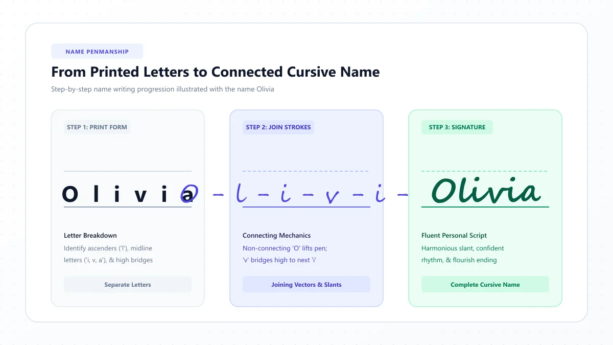
Name tattoo example: Olivia
Write the name Olivia in three different script fonts.
Compare the capital O, the tall l, the v-to-i connection, and the space inside the rounded letters.
The best version isn't automatically the one with the biggest flourish.
Choose the form that keeps the spelling clear and suits the intended size.
Best Cursive Fonts for Memorial Tattoos
Memorial tattoos often include a name, initials, date, or short meaningful phrase.
Because the lettering carries personal significance, accuracy matters especially.
Consider elegant styles such as Allura, Great Vibes, or a simpler handwritten approach.
However, one of the most personal options may be using a loved one's actual handwriting, when a suitable sample is available and its use is appropriate.
For example, a short handwritten note or signature can sometimes be adapted into a tattoo design.
A tattoo artist can assess whether the strokes need to be enlarged, separated, or adjusted for longevity.
If you're using handwriting from an original letter, avoid altering the wording unintentionally. Confirm the exact spelling and punctuation before approving the final stencil.
Best Cursive Fonts for Quote Tattoos
Quote tattoos require more planning than single-word designs.
Long text creates additional line breaks, more tight letter connections, and greater demands on spacing.
For short quotations, look at relatively open, readable scripts such as Dancing Script, Sacramento, or Satisfy.
For longer quotations, your artist may suggest a simpler lettering style rather than tightly connected cursive.
Popular short tattoo phrase ideas
Here are some brief examples to explore:
- Forever and always
- One day at a time
- Stay true
- Choose joy
- Be brave
- Keep going
- Breathe
- Remember
- Still growing
- Love without fear
- My own way
- Find your light
- Family first
- Let it be
- Here and now
A meaningful phrase should reflect your own values or experiences.
If you're quoting a book, song, or another source, confirm the exact wording and whether the text is appropriate to reproduce.
Best Cursive Tattoo Fonts for Different Placements
Placement changes how a design fits and moves with the body.
There is no universal minimum letter height that guarantees a tattoo will remain readable. Actual size depends on the font, line width, complexity, placement, skin, and the artist's technique.
Wrist tattoos
The wrist often offers a limited writing area.
Short words with relatively simple letterforms may be easier to accommodate than ornate multi-line quotes.
Consider restrained styles such as Sacramento or a simplified handwritten design.
Do not assume tiny hairline lettering will remain clear over time.
Forearm tattoos
The forearm can provide room for names, short quotations, and horizontal lettering.
It may allow more space for flourishes than a very small placement.
Consider Great Vibes, Dancing Script, or a custom script based on your preferred font.
Collarbone tattoos
The natural curve of the collarbone can complement flowing text.
However, the final arrangement must account for anatomy and body movement.
Try Parisienne, Allura, or a similarly elegant concept, subject to your artist's assessment.
Rib tattoos
The rib area may accommodate a longer design, but skin movement and the area's shape influence placement.
A short phrase with comfortable line spacing is often easier to plan than a dense paragraph.
Shoulder and upper back tattoos
Larger available spaces can offer more flexibility for ornamental capitals and decorative flourishes.
Formal scripts and custom calligraphy may be worth exploring.
Finger and hand tattoos
These areas can be challenging for very small lettering and intricate detail.
Rather than relying on a tiny digital font preview, discuss durability, placement, and potential touch-ups with a tattoo artist experienced in these locations.
Fine-Line vs. Bold Cursive Tattoo Lettering
The line weight of a tattoo matters as much as the font family.
Fine-line cursive
Fine-line lettering can create a delicate, subtle appearance.
It often uses narrow strokes and small details.
However, extremely thin strokes and closely spaced letters can become less distinct as the tattoo ages.
Your artist may recommend larger lettering or adjustments to preserve readability.
Bold cursive
Bold lettering has a stronger visual presence and may offer more substantial strokes.
But bold doesn't automatically mean readable.
If the interiors of letters are too narrow or the loops overlap, heavier strokes can also make the design crowded.
Which is better?
Neither approach is best for every situation.
Ask your artist to compare both versions of your exact text at the intended size.
Prioritize clear letterforms over the thinnest or heaviest possible strokes.
How to Choose a Cursive Tattoo Font That Ages Well
A tattoo isn't printed on paper. It lives on skin, which changes over time.
For lettering, preserving small spaces and clear letter shapes is especially important.
Use this checklist before approving a design.
Look for open letterforms
Letters such as e, a, and o need enough internal space to remain recognizable.
Avoid excessive crowding.
Check the connecting strokes
Cursive fonts often use narrow links between letters.
Ask whether those strokes need strengthening or separating.
Avoid excessive decorative loops
Long swashes can overlap nearby letters or compete with the actual wording.
A small number of controlled flourishes is generally easier to evaluate.
Review the font at actual size
Don't choose a font solely from a large website preview.
Print the lettering at the intended dimensions or ask your artist for a correctly scaled design.
Check the design from a normal viewing distance
A word that only looks readable when zoomed in may be too intricate for the intended placement.
Discuss long-term changes
Ask your tattoo artist how the stroke width, layout, and location could affect readability as the tattoo heals and ages.
No artist can guarantee that fine details will remain unchanged forever, but an experienced lettering specialist can help identify avoidable design problems.
How to Preview Cursive Tattoo Lettering Online
You can explore lettering ideas before your tattoo consultation.
A text generator is useful for comparing broad visual directions, but it's important to understand its limitations.
Step 1: Choose your words
Decide on the exact name, phrase, or date.
Check spelling, capitalization, and punctuation.
Step 2: Open a tattoo lettering generator
Visit our free Tattoo Font Generator.
Step 3: Type your text
Enter your chosen words.
For example:
Stay True
Step 4: Compare the available visual styles
Explore cursive script, bold lettering, or decorative variations.
Pay attention to which direction suits your idea.
Step 5: Export a reference
If useful, download a PNG preview to show your tattoo artist.
Treat the image as an inspiration reference rather than a finished stencil.
Step 6: Ask your artist to refine it
A professional tattoo artist should redraw or adjust the lettering for:
- Appropriate line thickness
- Readable letter spacing
- The intended body placement
- Natural skin curvature and movement
- The complexity of individual letterforms
- The long-term legibility of small details
Important distinction: The website's copyable cursive styles use Unicode characters. They are not the same as the 30 font families named in this guide, and the generator does not necessarily render those specific typefaces.
If you want to compare Great Vibes, Allura, or another named font exactly, use a font-preview tool that actually supports that font family.
Cursive Tattoo Fonts vs. Custom Hand Lettering
A font is a useful place to begin, but custom lettering can be more personal.
A tattoo artist who specializes in lettering may adjust a font's appearance or draw completely original script.
Using a font
A font provides a consistent alphabet and predictable visual style.
It's useful when comparing several directions before a consultation.
Using custom lettering
Custom lettering can be adapted to the exact name, body placement, and personal meaning of the tattoo.
An artist may simplify confusing letters, extend a capital, or alter spacing to fit the shape of the body.
Using personal handwriting
Some people prefer lettering based on their own handwriting or a meaningful handwritten note.
This can create a personal result that doesn't resemble a commercial font.
The final tattoo still needs to be reviewed and adapted for safe, readable execution.
Common Mistakes When Choosing Tattoo Script Fonts
Choosing only by appearance on a screen
A large preview can hide problems that become obvious at real tattoo size.
Better approach: Compare the design at the intended dimensions.
Making the tattoo too small
Small lettering leaves less room for fine details and enclosed spaces.
Better approach: Let the tattoo artist recommend dimensions appropriate to the chosen design.
Using too many flourishes
Elaborate capitals, loops, and underlines can compete with the main text.
Better approach: Select one or two decorative details.
Ignoring spelling and punctuation
Names, dates, and foreign-language phrases need careful checking.
Better approach: Confirm every character before approving the stencil.
Treating Unicode text as a final stencil
Copyable script characters are useful for digital inspiration, not automatically tattoo-ready artwork.
Better approach: Have the lettering prepared as a proper stencil by your tattoo artist.
Mixing unrelated font styles
Combining several decorative alphabets can make a short phrase look inconsistent.
Better approach: Choose one primary lettering direction.
Overlooking font licensing
If you're using a commercial font as part of a design, check its applicable license, especially when commissioning or distributing commercial artwork.
Better approach: Confirm the font's terms or use properly licensed design resources.
Failing to review the artist's lettering portfolio
Good general tattoo work doesn't automatically mean the artist specializes in detailed script lettering.
Better approach: Look for healed lettering examples and discuss the design before booking.
Questions to Ask Your Tattoo Artist
Before finalizing a cursive tattoo, ask:
- Will these letters remain readable at my preferred size?
- Which strokes or flourishes should be simplified?
- Is the placement suitable for this style?
- Should the spacing between specific letters be increased?
- Can you show the design at its actual dimensions?
- Do you have examples of healed script tattoos?
- Can you adapt this font reference into a custom lettering design?
- What changes should I realistically expect as the tattoo ages?
A consultation helps turn a digital inspiration image into a design appropriate for the intended location.
Frequently Asked Questions About Cursive Tattoo Fonts
What is the best cursive font for a name tattoo?
Great Vibes, Allura, Parisienne, and Sacramento are useful starting points. The best choice depends on the length of the name, intended size, and the artist's ability to adapt the lettering clearly.
Which cursive tattoo fonts are easy to read?
Fonts with recognizable letters, open shapes, and restrained flourishes are worth comparing. Sacramento, Dancing Script, Satisfy, and Courgette offer different readable-looking starting directions, but every design needs to be evaluated at the intended tattoo size.
Are thin cursive tattoo fonts a good idea?
Thin script can look elegant, but very fine strokes and crowded loops may become less distinct as the tattoo ages. A tattoo artist can advise whether the design needs greater size or line weight.
What font looks like elegant handwriting for tattoos?
Allura, Alex Brush, Parisienne, and Great Vibes are well-known scripts with elegant handwriting-inspired features.
Are there free cursive fonts for tattoo ideas?
Yes. Many fonts in this guide can be explored through Google Fonts. Check the current font licensing terms before using or redistributing design assets.
What are good fonts for small tattoo lettering?
Relatively simple, open letterforms are worth considering. However, there is no font that guarantees a tiny tattoo will remain readable. A qualified artist should assess the design and placement.
Can I use a cursive text generator to design a tattoo?
Yes, for concept exploration. A generator can help you visualize a phrase or compare decorative directions, but its output should not automatically be treated as a finished tattoo stencil.
What's the difference between a tattoo font and tattoo lettering?
A font is a reusable typeface. Tattoo lettering is the design actually applied to skin and may be based on a font, custom-drawn by an artist, or adapted from handwriting.
Are cursive tattoo fonts suitable for memorial tattoos?
Yes. Names, dates, and meaningful short phrases can be designed in cursive. Legibility, accurate spelling, and personal significance should guide the final choice.
Can I use someone's handwritten note as a tattoo?
Often, a handwritten sample can serve as design inspiration. A tattoo artist can adapt the strokes while trying to preserve their original character. Confirm that you have an appropriate copy of the writing and that the final result is readable.
What should I check before getting a quote tattoo?
Verify the exact words, spelling, punctuation, attribution, and any translation. Then evaluate the lettering at the actual tattoo size with an experienced artist.
Do bold cursive tattoos last longer than fine-line tattoos?
Heavier, well-spaced lines may preserve certain details better than extremely thin, densely packed strokes, but results depend on many factors. No particular font weight guarantees long-term appearance.
Final Thoughts: Choose Cursive Lettering That Looks Beautiful and Reads Clearly
The best cursive tattoo font isn't necessarily the one with the most elaborate capital letters or the thinnest strokes.
It's the one that helps express your chosen words clearly, fits the intended placement, and can be adapted into a design that remains recognizable as it ages.
Formal scripts such as Great Vibes and Pinyon Script offer classic elegance. Relaxed styles such as Sacramento and Dancing Script provide a natural handwritten feel. Bold options such as Pacifico and Lobster create a stronger visual statement.
Explore a few styles, compare your exact wording, and focus on readable letterforms rather than decoration alone.
When you're ready, bring your preferred references to a qualified tattoo artist who can help refine the final design.
For an initial lettering concept, try our free Tattoo Font Generator. It can help you explore decorative script directions and export a visual reference for your tattoo consultation.
References and further reading
- U.S. FDA — Tattoos and Permanent Makeup fact sheet
- U.S. FDA — Temporary tattoos, permanent makeup and safety
These links are provided for further reading. External websites and information may change.