Your wedding invitation is more than a piece of stationery. It's the first glimpse your guests receive of your celebration.
Before anyone reads the venue or the date, the design already communicates something about your wedding. Elegant calligraphy can feel romantic and traditional. Soft handwritten lettering can suggest a relaxed garden celebration. A delicate script paired with modern typography can create a beautifully understated look.
But with so many typefaces available, choosing the best wedding invitation fonts can feel overwhelming.
Some cursive fonts feature dramatic flourishes and delicate strokes. Others look like natural handwriting or vintage penmanship. And while a font might look beautiful on a large screen, it may become difficult to read when printed on a small invitation.
That's why the perfect wedding font needs to balance appearance with readability.
In this guide, you'll discover 25 beautiful cursive and calligraphy fonts for wedding invitations, including timeless formal scripts, romantic lettering, modern handwriting, and distinctive decorative styles.
You'll also learn how to pair fonts, choose lettering for different wedding themes, prepare invitations for printing, and design coordinated stationery that looks elegant without sacrificing clarity.
What Are the Best Fonts for Wedding Invitations?
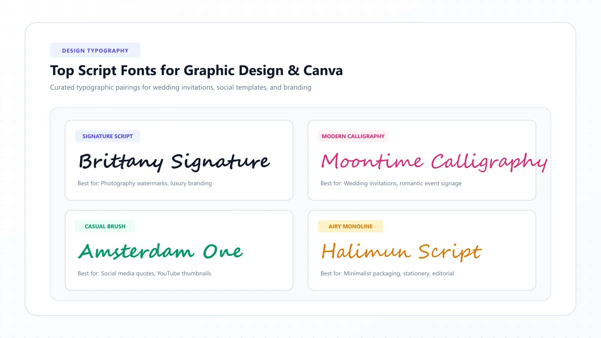
If you want a quick answer, start with Great Vibes, Allura, Alex Brush, Pinyon Script, Parisienne, and Sacramento.
These offer different interpretations of cursive lettering, from formal calligraphy to clean, understated handwriting.
For example:
- Great Vibes: Romantic and formal, especially for a couple's names.
- Allura: Delicate and elegant, suitable for understated wedding stationery.
- Alex Brush: Flowing calligraphy with a warm handwritten feel.
- Pinyon Script: Traditional, refined lettering inspired by historical penmanship.
- Parisienne: Soft, romantic script with vintage charm.
- Sacramento: Simple monoline lettering for minimalist invitations.
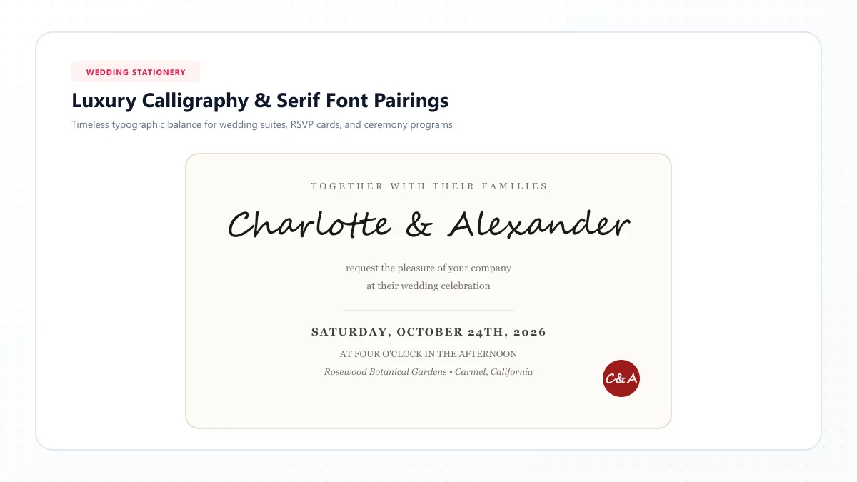
The best approach is usually to combine one decorative font with one readable supporting typeface.
Use the cursive font for the names or a short heading. Use a serif or sans-serif for the date, time, venue, directions, and RSVP instructions.
That combination gives the invitation personality while keeping the information clear.
25 Elegant Wedding Invitation Fonts at a Glance
Here's an overview of the 25 fonts featured in this guide.
# | Font | Main style | Best use |
|---|---|---|---|
1 | Great Vibes | Formal calligraphy | Couple's names |
2 | Allura | Elegant flowing script | Romantic invitations |
3 | Alex Brush | Expressive brush script | Classic wedding stationery |
4 | Pinyon Script | Historical formal script | Black-tie weddings |
5 | Parisienne | Romantic vintage script | Garden weddings |
6 | Tangerine | Light, airy calligraphy | Delicate headings |
7 | Italianno | Tall, flowing script | Elegant name lines |
8 | Petit Formal Script | Restrained formal lettering | Traditional stationery |
9 | Mrs Saint Delafield | Ornamental handwriting | Luxury-inspired accents |
10 | Monsieur La Doulaise | Elaborate calligraphy | Decorative monograms |
11 | Sacramento | Minimalist monoline script | Modern weddings |
12 | Dancing Script | Friendly handwritten script | Relaxed celebrations |
13 | Satisfy | Casual flowing script | Rustic invitations |
14 | Rochester | Vintage cursive | Classic romantic designs |
15 | Cookie | Charming brush lettering | Handmade stationery |
16 | MonteCarlo | Delicate signature-style script | Contemporary romance |
17 | Rouge Script | Elegant calligraphy | Wedding headings |
18 | Qwigley | Expressive handwriting | Artistic stationery |
19 | Ruthie | Decorative script | Dramatic names |
20 | Herr Von Muellerhoff | Ornate historical script | Traditional monograms |
21 | Ballet | Dramatic, high-contrast script | Statement headings |
22 | Moon Dance | Airy handwritten lettering | Soft modern designs |
23 | The Nautigal | Flourished script | Vintage-inspired stationery |
24 | Shalimar | Flowing handwritten calligraphy | Romantic accents |
25 | Corinthia | Fine, graceful script | Delicate invitations |
These are genuine font-family names worth exploring. Availability in Canva, Microsoft Word, Adobe applications, or other design tools depends on the platform and which fonts you have installed.
Classic and Formal Wedding Invitation Fonts (1–10)
Formal script fonts are particularly appropriate when you want traditional elegance, historical character, or beautiful calligraphy-inspired names.
1. Great Vibes — Best Overall for Romantic Wedding Invitations
Great Vibes is a graceful connected script with dramatic capital letters and flowing lowercase forms.
Its decorative letter shapes create an unmistakably romantic appearance.
It is especially effective when the couple's names are the main visual feature on the invitation.
Best for: Classic weddings, elegant stationery, formal invitation headings.
Suggested pairing: Great Vibes + Cormorant Garamond.
Use Great Vibes for the names and Cormorant Garamond for the supporting information.
Design tip: Give the capital letters enough room so their flourishes don't overlap the surrounding text.
2. Allura — Best for Soft, Understated Elegance
Allura combines flowing curves with a gentle handwritten rhythm.
It is less theatrical than some highly ornamental calligraphy fonts, making it useful for romantic but restrained designs.
Its delicate strokes look attractive with soft colors, minimal illustrations, and generous white space.
Best for: Romantic invitations, thank-you notes, bridal stationery.
Suggested pairing: Allura + Playfair Display.
Design tip: Preview thin strokes on your intended paper rather than relying only on the digital image.
3. Alex Brush — Best for Warm, Classic Calligraphy
Alex Brush features expressive brush-inspired letterforms and distinctive capital strokes.
It conveys elegance without the highly structured appearance of some formal penmanship styles.
The font works well for names and short wedding-related phrases.
Best for: Elegant wedding invitations, romantic headings, personalized stationery.
Suggested pairing: Alex Brush + Lora.
Design tip: Use the decorative font for a short line and preserve ordinary typography for essential details.
4. Pinyon Script — Best for Traditional Black-Tie Weddings
Pinyon Script has an elegant, historical appearance reminiscent of formal penmanship.
Its controlled shapes and decorative capitals can create a sense of ceremony and tradition.
It's an excellent reference for invitations with classic borders, monograms, and refined layouts.
Best for: Black-tie weddings, formal invitations, heritage-inspired stationery.
Suggested pairing: Pinyon Script + EB Garamond.
Design tip: Use a generous script size and avoid squeezing multiple ornate capitals together.
5. Parisienne — Best for Romantic Vintage Invitations
Parisienne features elegant, rounded letterforms with an inviting, vintage character.
It can feel both sophisticated and warm.
The font suits weddings with soft botanical illustrations, romantic colors, or French-inspired design details.
Best for: Garden weddings, romantic stationery, boutique invitation designs.
Suggested pairing: Parisienne + Libre Baskerville.
Design tip: Keep line breaks balanced and avoid placing the script over a busy floral illustration.
6. Tangerine — Best for Delicate Calligraphy
Tangerine is an airy script with fine strokes and elongated letterforms.
It can look exceptionally graceful in large headings.
However, its delicate construction needs particular attention when printing.
Best for: Larger names, romantic headings, delicate stationery accents.
Suggested pairing: Tangerine + Cormorant Garamond.
Design tip: Don't use Tangerine for small addresses or RSVP instructions. Test the lettering at its actual printed size.
7. Italianno — Best for Flowing, Narrow Lettering
Italianno has tall, elegant forms and a light handwritten appearance.
Its relatively narrow proportions can be attractive for longer names, although readability still depends on the exact wording.
The overall effect is romantic and understated.
Best for: Elegant name lines, garden-inspired invitations, artistic stationery.
Suggested pairing: Italianno + Marcellus.
Design tip: Allow enough vertical space for ascenders, descenders, and decorative endings.
8. Petit Formal Script — Best for Restrained Formality
Petit Formal Script offers an orderly, formal lettering style.
Its controlled shapes suit invitations that need traditional character without exaggerated swashes.
It's useful for couples who prefer refinement over dramatic decoration.
Best for: Formal stationery, classic invitations, restrained wedding typography.
Suggested pairing: Petit Formal Script + EB Garamond.
Design tip: Compare the complete invitation with one using a simpler heading to make sure the script adds value.
9. Mrs Saint Delafield — Best for Expressive Luxury-Inspired Lettering
Mrs Saint Delafield has a loose, flowing character with expressive flourishes.
It resembles elegant personal handwriting and can create a distinctive visual accent.
Because of its slender strokes, it works best where there is plenty of space.
Best for: Luxury-inspired invitations, romantic headings, decorative name treatments.
Suggested pairing: Mrs Saint Delafield + Playfair Display.
Design tip: Use larger lettering with a clean background to keep the name recognizable.
10. Monsieur La Doulaise — Best for Dramatic Formal Calligraphy
Monsieur La Doulaise is highly ornamental, featuring long, elegant strokes and historical calligraphy influences.
It's well suited to short decorative text rather than full invitation wording.
A carefully placed monogram or couple's name can become the centerpiece of the design.
Best for: Traditional invitations, statement names, decorative initials.
Suggested pairing: Monsieur La Doulaise + Cormorant Garamond.
Design tip: Limit the script to one focal element. Elaborate flourishes can easily overwhelm a small card.
Modern and Romantic Cursive Fonts (11–18)
Modern wedding fonts often look more natural and less formal.
They work well for garden celebrations, contemporary receptions, outdoor weddings, and handmade stationery.
11. Sacramento — Best for Minimalist Wedding Invitations
Sacramento is a clean, monoline script inspired by informal mid-century handwriting.
Its relatively restrained letterforms make it ideal for couples who want a modern, elegant look without elaborate decoration.
Best for: Minimalist weddings, contemporary stationery, modern save-the-date cards.
Suggested pairing: Sacramento + Montserrat.
Design tip: Use a comfortable script size and let the white space become part of the design.
12. Dancing Script — Best for Relaxed and Joyful Weddings
Dancing Script uses playful, slightly bouncing letterforms.
It feels friendly, lively, and informal.
This makes it a natural choice for celebrations that prioritize warmth and personality over strict tradition.
Best for: Garden weddings, casual receptions, rustic invitations.
Suggested pairing: Dancing Script + Lato.
Design tip: Choose a suitable font weight and avoid mixing it with other playful scripts.
13. Satisfy — Best for Rustic Wedding Stationery
Satisfy resembles relaxed, flowing handwriting.
Its curves bring a personal touch to stationery and decor.
It works particularly well when paired with natural textures, kraft-inspired colors, or simple botanical illustrations.
Best for: Rustic weddings, outdoor celebrations, handmade invitation suites.
Suggested pairing: Satisfy + Libre Baskerville.
Design tip: Keep the paper and decoration simple so the lettering remains the focal point.
14. Rochester — Best for Timeless Vintage Romance
Rochester has a vintage cursive personality with refined letterforms.
It is less exaggerated than some ornamental scripts, making it suitable for thoughtful, nostalgic designs.
Best for: Classic romance, vintage-themed invitations, elegant headings.
Suggested pairing: Rochester + Cormorant Garamond.
Design tip: Compare it in dark brown, navy, or charcoal on a warm paper background.
15. Cookie — Best for Charming Handmade Invitations
Cookie offers friendly brush-style lettering with an informal, nostalgic feel.
It's well suited to a celebration that feels intimate and personal rather than ceremonial.
Best for: Handmade stationery, rustic weddings, informal celebration cards.
Suggested pairing: Cookie + Lora.
Design tip: Pair it with plenty of space and a straightforward body font to avoid an overly casual invitation.
16. MonteCarlo — Best for Contemporary Romantic Typography
MonteCarlo has a flowing signature-like appearance with delicate, elegant movement.
Its graceful forms work nicely for modern weddings using neutral or pastel palettes.
Best for: Contemporary romance, delicate name headings, sophisticated stationery.
Suggested pairing: MonteCarlo + Playfair Display.
Design tip: Keep the main script line short and avoid shrinking it excessively.
17. Rouge Script — Best for Graceful, Expressive Calligraphy
Rouge Script features flowing strokes with a decorative handwritten personality.
It can feel romantic without following the precise structure of formal historical penmanship.
Best for: Romantic invitations, feminine-inspired stationery, event headings.
Suggested pairing: Rouge Script + Cormorant Garamond.
Design tip: Check how the opening capital interacts with the next letter of each name.
18. Qwigley — Best for Artistic Wedding Stationery
Qwigley has elongated, expressive letterforms and an informal calligraphic rhythm.
It feels personal and distinctive, making it suitable for creative couples.
Its decorative shapes deserve additional space.
Best for: Artistic wedding invitations, stylish name lettering, decorative headings.
Suggested pairing: Qwigley + EB Garamond.
Design tip: Test both names together, since decorative capitals can look crowded when separated by an ampersand.
Decorative and Distinctive Calligraphy Fonts (19–25)
These fonts offer more expressive or unusual styling.
They can work beautifully for statement headings, monograms, and specialty stationery, but are generally less appropriate for small invitation details.
19. Ruthie — Best for Expressive Romantic Names
Ruthie has an ornate, handwritten appearance with distinctive strokes.
It can give a short name or invitation heading a dramatic personality.
Best for: Artistic stationery, decorative couple's names, romantic headings.
Suggested pairing: Ruthie + Lora.
Design tip: Use it for just one focal line and confirm every letter remains recognizable.
20. Herr Von Muellerhoff — Best for Historical Calligraphy
Herr Von Muellerhoff draws inspiration from highly ornamental historical script.
Its elaborate movements are suited to formal and heritage-inspired designs.
It can become visually complicated when used with long phrases.
Best for: Monograms, black-tie invitations, short ornamental headings.
Suggested pairing: Herr Von Muellerhoff + EB Garamond.
Design tip: Give it generous room and avoid using it for practical guest information.
21. Ballet — Best for Dramatic Wedding Typography
Ballet features expressive high-contrast strokes and calligraphic movement.
Its dramatic appearance works best as a large display treatment.
It can feel contemporary and theatrical when used with restrained supporting typography.
Best for: Statement invitations, modern luxury-inspired weddings, editorial-style stationery.
Suggested pairing: Ballet + Montserrat.
Design tip: Test thin strokes carefully and use a strong contrast between text and background.
22. Moon Dance — Best for Soft, Dreamy Lettering
Moon Dance uses airy, loose handwritten forms that feel gentle and spontaneous.
It's a good alternative to rigid formal calligraphy.
It can complement watercolor botanicals, soft neutrals, and relaxed romantic designs.
Best for: Bohemian weddings, garden invitations, soft contemporary stationery.
Suggested pairing: Moon Dance + Cormorant Garamond.
Design tip: Keep the surrounding elements restrained and give the script enough room to breathe.
23. The Nautigal — Best for Flourished Vintage Designs
The Nautigal offers dramatic cursive movement with decorative letter shapes.
It suits vintage-inspired or expressive stationery that benefits from ornamental headings.
Best for: Vintage invitations, creative monograms, elegant statement names.
Suggested pairing: The Nautigal + Libre Baskerville.
Design tip: Check the available font weights and the appearance of capitals in your specific design application.
24. Shalimar — Best for Delicate Romantic Accents
Shalimar has flowing handwritten qualities and fine, decorative strokes.
It can bring softness to romantic layouts.
Because some details are delicate, it should be evaluated at the final print size.
Best for: Romantic invitations, save-the-date headings, subtle calligraphy accents.
Suggested pairing: Shalimar + Lora.
Design tip: Use strong ink contrast and a clean background to preserve clarity.
25. Corinthia — Best for Fine, Graceful Calligraphy
Corinthia is a graceful script with expressive handwriting-inspired shapes.
Its soft movement creates a refined atmosphere suitable for romantic stationery.
Best for: Elegant invitations, anniversary stationery, names and monograms.
Suggested pairing: Corinthia + Playfair Display.
Design tip: Preview the font on the exact paper you intend to use, particularly if the design includes delicate strokes.
Best Wedding Invitation Fonts by Wedding Style
Different weddings benefit from different typographic moods.
Use this table to narrow the 25 choices.
Wedding style | Recommended fonts | Visual direction |
|---|---|---|
Black-tie | Pinyon Script, Great Vibes | Classic, formal |
Traditional | Petit Formal Script, Allura | Timeless elegance |
Romantic garden | Parisienne, Alex Brush | Soft and graceful |
Rustic or barn | Satisfy, Cookie | Relaxed handwriting |
Bohemian | Moon Dance, Dancing Script | Natural and playful |
Minimalist | Sacramento, MonteCarlo | Restrained and modern |
Vintage | Rochester, The Nautigal | Nostalgic typography |
Luxury-inspired | Ballet, Mrs Saint Delafield | Decorative statement |
Artistic | Qwigley, Ruthie | Expressive lettering |
Intimate celebration | Allura, Sacramento | Gentle and personal |
These are design directions, not rigid rules. The overall result also depends on paper, color, illustration, and the supporting typeface.
10 Elegant Wedding Invitation Font Pairings
A script font usually looks best when paired with something simpler.
The decorative font can carry the emotional emphasis, while the supporting font communicates practical information.
Script font | Supporting font | Best for |
|---|---|---|
Great Vibes | Cormorant Garamond | Classic romantic invitations |
Allura | Playfair Display | Soft formal weddings |
Pinyon Script | EB Garamond | Black-tie stationery |
Parisienne | Libre Baskerville | Romantic garden weddings |
Sacramento | Montserrat | Minimalist invitations |
Dancing Script | Lato | Relaxed celebrations |
Alex Brush | Lora | Classic with a warm touch |
Italianno | Marcellus | Vintage-inspired elegance |
MonteCarlo | Playfair Display | Contemporary romance |
Moon Dance | Cormorant Garamond | Soft bohemian styling |
Why these combinations work
A script font and a conventional serif or sans-serif perform different roles.
For example, Great Vibes can provide elegant lettering for:
the couple’s names and section headings
Cormorant Garamond can then carry the smaller details:
Saturday, June 12
Four o'clock in the afternoon
The Garden House
The visual difference makes the design easier to scan.
You usually need only two fonts. A third can work as a small accent, but additional decorative typefaces often compete with one another.
How to Choose the Right Wedding Invitation Font
There are several practical factors to consider before choosing a typeface.
1. Match the font to the celebration
A formal ballroom wedding may benefit from Great Vibes or Pinyon Script.
A relaxed outdoor celebration may feel more natural with Dancing Script or Satisfy.
A contemporary minimalist invitation may look better with Sacramento and a simple sans-serif.
Choose typography that supports the overall wedding mood.
2. Check the exact names
Script fonts can look very different depending on the letters used.
For example, a font may have a beautiful capital E but a highly decorative capital W that becomes difficult to read.
Type both names into the font preview.
Check the capitals, connections, and ampersand before making a decision.
3. Use readable text for important information
Guests need to find the date, time, venue, address, and RSVP instructions quickly.
Use a clear serif or sans-serif for these details.
Save ornamental script for the couple's names, a short phrase, or a decorative heading.
4. Consider your invitation size
A font that looks elegant on a large screen may become difficult to read on a printed card.
A common wedding invitation format is 5 × 7 inches, but your layout may differ.
Test the design at its actual dimensions.
5. Think about your paper
Textured paper, cotton stock, coated paper, and digital printing can produce different results.
Very thin script strokes may reproduce less clearly on certain surfaces or with particular printing methods.
Ask your printer for a sample if you're using delicate lettering or special finishes.
6. Check your budget and font license
Many beautiful font families are available through Google Fonts.
Other typefaces require commercial licenses or platform subscriptions.
If you're using a premium font, confirm that your intended printed or digital invitation use is permitted.
Wedding Invitation Font Sizes: What Works Best?
There is no universal font size that suits every invitation.
Actual readability depends on the typeface, print quality, paper, contrast, and intended viewing distance.
However, the following ranges are useful starting points for a typical 5 × 7-inch invitation.
Text element | Starting size |
|---|---|
Couple's names in cursive | 28–42 pt |
Supporting heading | 14–18 pt |
Date and time | 11–14 pt |
Venue and address | 10–12 pt |
RSVP instructions | 10–12 pt |
Small decorative accents | Depends on style |
These are design suggestions rather than guaranteed minimums.
A thin calligraphy font may require a larger size than a conventional serif.
If a guest cannot read the information comfortably at normal viewing distance, increase its size or change the typeface.
For smaller cards or detailed invitation suites, consider moving additional instructions onto a separate insert.
How to Design a Wedding Invitation With Two Fonts
Here's a simple process for creating elegant typography without complicated design software.
Step 1: Select the wedding style
Choose an overall direction such as classic, romantic, rustic, modern, or vintage.
Step 2: Choose one script font
For example, select Great Vibes for a traditional romantic invitation.
Step 3: Choose one supporting font
Pair it with Cormorant Garamond for the practical information.
Step 4: Create a clear hierarchy
Make the couple's names the main visual focus.
Use smaller, readable text for the supporting content.
Step 5: Organize the wording
Group related information together:
Host or introductory line
Couple's names
Wedding date and time
Venue
Reception information
RSVP details
Step 6: Adjust spacing
Add enough space around the main names.
Avoid placing ornamental flourishes too close to another line.
Step 7: Limit decorative elements
A subtle border, floral illustration, or monogram may be enough.
Avoid combining numerous ornate patterns with elaborate scripts.
Step 8: Print a proof
Print the invitation at its actual size and review it carefully.
Check every word, date, and address before ordering the full batch.
Three Beautiful Wedding Invitation Typography Examples
These layouts show how to combine fonts for different wedding moods.
The names, dates, and locations are fictional examples.
Example 1: Classic Romantic Invitation
Main script: Great Vibes
Supporting font: Cormorant Garamond
Together with their families
Emma & Oliver
Request the pleasure of your company
Saturday, June 12, 2027
At four o'clock in the afternoon
The Garden House
A reception will follow
For this design, the couple's names appear in a large elegant script. Everything else uses a readable serif.
A cream background, charcoal text, and generous white space can create a refined appearance.
Example 2: Modern Minimalist Wedding
Main script: Sacramento
Supporting font: Montserrat
Sophia & James
We're getting married
September 18, 2027
The Glasshouse
Ceremony at 5:00 PM
Celebrate with us afterward
This layout can work with a white background, muted accent color, and simple spacing.
Use Sacramento only for the names and Montserrat for the rest.
Example 3: Rustic Garden Wedding
Main script: Dancing Script
Supporting font: Lato
Olivia & Noah
Join us for a celebration of love
May 22, 2027
The Meadow Barn
Ceremony begins at 3:30 PM
Dinner and dancing to follow
Pair the friendly script with botanical illustrations or earthy colors.
The result should feel relaxed without sacrificing readability.
Best Fonts for Save-the-Date Cards
Save-the-date cards usually contain less information than full invitations.
That makes them a suitable place to use a slightly more expressive font.
Consider:
Great Vibes: For classic romance.
Parisienne: For soft, vintage charm.
Sacramento: For modern minimalism.
Dancing Script: For relaxed, joyful celebrations.
MonteCarlo: For refined contemporary styling.
The couple's names can use the decorative font.
Keep the date and location readable, especially if the card will be viewed on a small phone screen.
Best Fonts for Wedding RSVP Cards
RSVP cards are functional pieces of stationery.
Guests need to understand how and when to respond.
A small script heading such as Kindly Reply can add elegance, but the instructions should remain clear.
For example:
Decorative heading: Allura
Supporting font: EB Garamond
Kindly Reply
Please respond by May 1, 2027
We joyfully accept
We regretfully decline
Keep response options easy to understand and leave enough space for handwriting if using printed cards.
Best Fonts for Wedding Menus and Place Cards
Wedding menus and place cards are often viewed in different lighting conditions.
Tiny, delicate lettering may become difficult to read in a dim reception room.
Place cards
Use a script font for guest names if the lettering remains recognizable.
Allura, Parisienne, or a restrained calligraphy style can work beautifully.
Menu headings
A script heading can add personality.
For example:
Salad, Mains, Dessert
Then use EB Garamond, Lora, or another readable font for dish descriptions and dietary information.
Seating charts
Because people may need to scan many names, prioritize clarity.
A decorative title such as Seating Chart is fine, but the individual guest names and table numbers should be easy to locate.
Best Free Wedding Invitation Fonts
Many script fonts are available through Google Fonts, including:
- Great Vibes
- Allura
- Alex Brush
- Pinyon Script
- Parisienne
- Tangerine
- Sacramento
- Dancing Script
- Satisfy
- MonteCarlo
Google Fonts offers open-source typefaces with licensing information, making it a useful starting point for couples and designers.
However, always check the actual license of the font family you're using.
A font being available on a third-party website doesn't necessarily mean every download or bundled asset carries identical usage rights.
If you plan to sell invitation templates, redistribute editable products, or bundle font files, review the license requirements carefully.
Free vs. Premium Wedding Calligraphy Fonts
Free and premium fonts can both produce excellent wedding invitations.
The difference is often the number of available glyphs, alternate letters, swashes, and special design features.
Free font advantages
You can experiment without purchasing multiple typefaces.
Many popular free scripts work well for ordinary wedding stationery.
They are accessible through reputable font libraries.
Premium font advantages
Some premium fonts include more alternate capital letters, ligatures, and ornamental swashes.
These can help create a custom-looking composition.
Premium fonts may also come with additional font weights or coordinated families.
Which should you choose?
If you want a simple and elegant invitation, a free font may be entirely sufficient.
If you need highly customized calligraphy, unusual letter combinations, or distinctive ornamentation, a carefully chosen premium font—or bespoke lettering—may offer more flexibility.
The final result depends far more on thoughtful design than on the price of the font.
Can You Use Canva for Wedding Invitation Fonts?
Yes. Canva can be useful for DIY wedding stationery.
You can create an invitation layout, add text, and choose among the typefaces available in your account.
However, Canva's font library and Free/Pro availability can change.
To find a specific script:
- Open your invitation design.
- Add a text box for the couple's names.
- Open the font picker.
- Search for the font name.
- Apply it and inspect the full wording.
- Pair it with a readable supporting font.
- Export a suitable file and print a sample.
If the exact font isn't available, choose a similar licensed typeface rather than assuming every font from a recommendation list is included in Canva.
For a larger selection of Canva-specific recommendations, see our separate guide to the best cursive fonts for Canva.
Can You Use a Cursive Text Generator for Wedding Invitations?
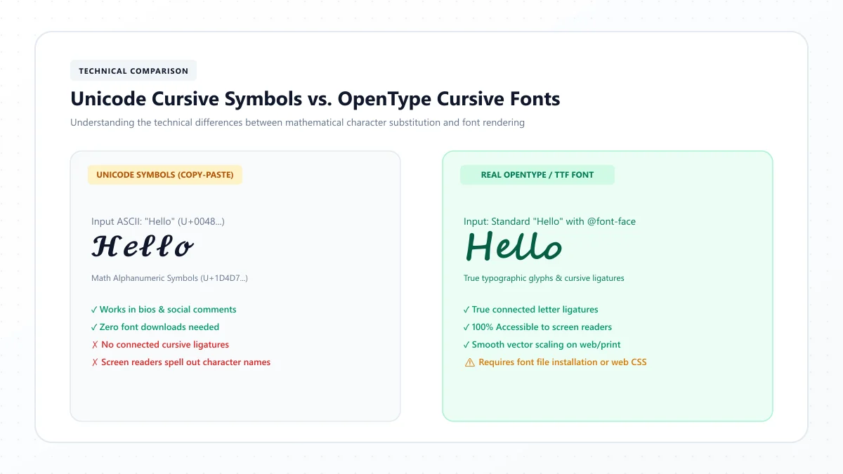
A cursive text generator can help you experiment with decorative lettering, but it isn't the same as selecting a real typeface in a design application.
For example, our Cursive Text Generator creates decorative Unicode characters that can be copied into compatible text fields.
Those characters are useful for digital inspiration, aesthetic messages, and some online profiles.
However, professional invitation designs generally benefit from actual font files.
A real typeface provides better control over:
- Letter spacing
- Font sizing
- Line height
- Glyph substitutions
- Consistent rendering
- Layout and print output
Use a decorative text generator to explore visual directions, then create the finished invitation with actual fonts in appropriate design software.
Wedding Invitation Printing Tips
Even a beautiful font pairing can produce disappointing stationery if the final printing process isn't considered.
Print at the actual size
Don't evaluate your invitation only while zoomed in on a computer screen.
Print a sample at 100% scale.
Check delicate strokes
Thin script details can reproduce differently on coated, uncoated, and textured paper.
Review the final paper and printing method with your stationery supplier.
Use sufficient contrast
Pale gray script on cream paper may look subtle on a monitor but become difficult to read in print.
Choose an ink and background combination with clear contrast.
Prepare print-ready files
Follow your printer's specifications for dimensions, bleed, color settings, and export format.
Don't assume every print shop uses the same file requirements.
Check font embedding
When sending a PDF to a printer, confirm that fonts are embedded or otherwise handled correctly.
This helps avoid unexpected substitutions.
Proofread every detail
Confirm:
Names
Wedding date
Time
Venue spelling
Address
RSVP deadline
Contact information
A font choice can be revised. A batch of invitations printed with the wrong date is far more expensive to correct.
Common Wedding Invitation Font Mistakes
Using too many scripts
Combining several ornate fonts can make the invitation appear cluttered.
Better approach: Choose one decorative script and one supporting font.
Using cursive for addresses
Long calligraphy passages can be difficult to scan.
Better approach: Reserve script for names and short headings.
Making the names too small
Decorative capitals may lose their character when reduced.
Better approach: Let the names become the main visual focal point.
Ignoring unusual letters
Some fonts have highly stylized capitals that may look unfamiliar.
Better approach: Preview the exact names before choosing.
Adding excessive flourishes
Long swashes can overlap other text or illustrations.
Better approach: Use decorative strokes selectively.
Using poor contrast
Light lettering against a patterned background can be hard to read.
Better approach: Increase contrast and simplify the background.
Skipping the print test
A design may look different after printing.
Better approach: Review a physical proof on the intended paper.
Forgetting font licenses
A typeface may be free for personal work but restricted for certain commercial uses.
Better approach: Confirm usage rights before selling templates or distributing editable files.
Frequently Asked Questions About Wedding Invitation Fonts
What is the best font for wedding invitations?
Great Vibes, Allura, Pinyon Script, and Alex Brush are useful script choices for romantic invitations. Pair one with a readable serif or sans-serif for the wedding details.
What is the most elegant cursive wedding font?
Great Vibes and Pinyon Script are strong starting points for traditional elegance. Allura and Parisienne offer softer romantic alternatives.
What fonts are used for formal wedding invitations?
Formal invitations often use refined scripts, historical-looking serifs, or a combination. Pinyon Script, Great Vibes, Cormorant Garamond, and EB Garamond are worth comparing.
Which font is best for modern wedding invitations?
Sacramento, MonteCarlo, and other restrained handwritten scripts can complement modern typography. Pair them with Montserrat or a clean contemporary serif.
Are free wedding invitation fonts good enough?
Yes. Many free fonts can produce excellent invitations when they're paired thoughtfully and printed correctly. A premium font isn't required for an elegant design.
What fonts pair well with Great Vibes?
Cormorant Garamond, EB Garamond, and Lora are good supporting options. They provide clear contrast with the decorative script.
How many fonts should I use on a wedding invitation?
Two fonts are usually sufficient: one decorative font and one readable supporting font. A third can be introduced for a specific accent, but it isn't necessary.
What font size should wedding invitation text be?
The couple's names often work well at approximately 28–42 points in a standard invitation design, while supporting details may begin around 10–14 points. Actual size should be chosen through a physical print test.
Should wedding invitation fonts be cursive?
Not all of them. Cursive is often beautiful for names and short phrases, while ordinary serif or sans-serif fonts are generally more practical for dates, addresses, and instructions.
Which cursive fonts work for rustic weddings?
Dancing Script, Satisfy, and Cookie offer friendly, informal lettering styles worth exploring for rustic or handmade wedding stationery.
Which fonts are good for black-tie weddings?
Pinyon Script, Great Vibes, and traditional serif combinations can create a refined, formal appearance.
Can I use Google Fonts for wedding invitations?
Yes. Many Google Fonts families are available under open licenses suitable for printed stationery. Check the specific font's current license and any distribution requirements.
Can I use Canva fonts for invitations I sell?
Many Canva designs can be used commercially under applicable Canva licensing terms, but permissions depend on the content and use. Confirm the current terms before selling templates or redistributed assets.
What fonts should I use for RSVP cards?
Use a readable serif such as EB Garamond, Lora, or Libre Baskerville for the instructions. A short decorative heading can use the same script as the main invitation.
How do I make wedding invitations look expensive?
Use consistent typography, balanced spacing, quality paper, strong contrast, and a restrained color palette. A beautiful font alone won't create a polished design.
Final Thoughts: Choose Wedding Fonts That Feel Beautiful and Read Clearly
The best wedding invitation fonts do more than look elegant.
They help communicate the atmosphere of your celebration while keeping essential details comfortable to read.
Great Vibes and Pinyon Script bring traditional formality. Allura, Parisienne, and Alex Brush offer graceful romance. Sacramento, Dancing Script, and Moon Dance provide softer, more contemporary alternatives.
Start by choosing one font that reflects your wedding style.
Then pair it with a readable supporting typeface, test the exact names, and print a sample at the final invitation size.
The most memorable invitations are often the ones that balance personality with simplicity.
For decorative script inspiration, you can explore our free Cursive Text Generator. For your final printed stationery, use genuine typefaces and an appropriate design and printing workflow.
References and further reading
- Emily Post Institute — Wedding invitations guide
- Emily Post Institute — Formal wedding invitation wording samples
These links are provided for further reading. External websites and information may change.