Have you ever noticed that two people can write the same word in cursive, yet their handwriting looks completely different?
One person's letters might be round and upright, while another's lean forward with elegant loops. Some cursive writing looks simple enough for an elementary school notebook. Other styles resemble the beautiful handwriting found in old letters and historical documents.
That's because cursive writing isn't just one handwriting style.
Over time, different handwriting systems have developed to serve different purposes. Some were designed to help children move from printing to joined-up writing. Others emphasized speed, readability, personal expression, or decorative penmanship.
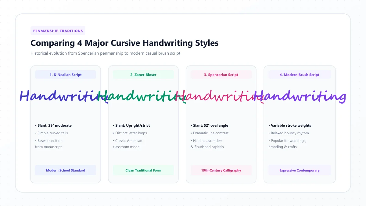
Four names you'll often encounter are D'Nealian, Zaner-Bloser, Spencerian, and modern cursive script.
Although they all belong to the wider world of flowing handwriting, they aren't interchangeable.
In this guide, we'll explain what makes each style unique, explore their histories, compare their letter shapes and connecting strokes, and help you choose the right cursive style for school, everyday handwriting, or creative lettering.
What Are Cursive Writing Styles?
Cursive writing styles are different approaches to forming handwritten letters using flowing movements, connecting strokes, and recognizable letter patterns.
Although many people associate cursive with continuously joined letters, the exact rules vary between handwriting methods.
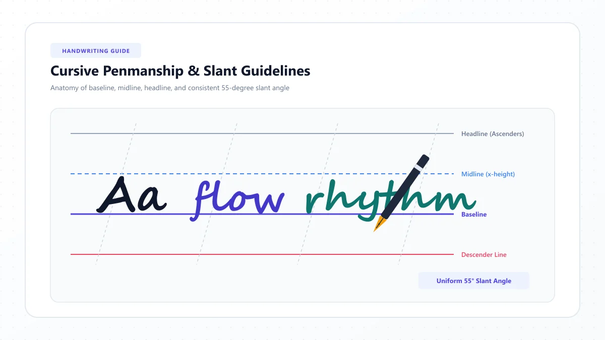
Some styles use prominent loops. Others simplify those loops or eliminate them from certain letters. Some favor a noticeable forward slant, while others are nearly upright.
The differences usually involve five features:
- Letter shape: How individual uppercase and lowercase letters are formed.
- Slant: Whether letters stand upright or lean forward.
- Connections: How one letter joins the next.
- Loops and flourishes: How much decoration or curved movement appears.
- Writing movement: Whether the method emphasizes finger control, rhythmic forearm movement, or deliberate calligraphic strokes.
These features influence both the appearance of handwriting and how it is taught.
The Four Main Styles at a Glance
Style | Defining characteristic | Typical purpose |
|---|---|---|
D'Nealian | Slanted manuscript with connecting-style strokes | Transition from printing to cursive |
Zaner-Bloser | Upright manuscript followed by traditional cursive | Structured school handwriting instruction |
Spencerian | Flowing, oval-based letters with elegant forms | Historical penmanship and decorative writing |
Modern cursive script | A broad range of simplified or personalized styles | Everyday handwriting and contemporary lettering |
D'Nealian and Zaner-Bloser are named educational programs. Spencerian is a historical penmanship system, while modern cursive is a broader description covering multiple approaches.
Understanding this distinction makes it easier to compare the styles fairly.
1. D'Nealian Cursive Writing: A Bridge Between Print and Cursive
D'Nealian handwriting was developed by educator Donald Neal Thurber and introduced in the late 1970s.
Its main idea was to make the transition from manuscript printing to cursive handwriting more gradual.
In many traditional handwriting programs, children first learn upright printed letters and later learn a noticeably different cursive alphabet.
D'Nealian takes another approach.
Its manuscript letters already use gentle slants and connecting-style finishing strokes. When learners move to cursive, many of those familiar movements carry over.
What Does D'Nealian Handwriting Look Like?
D'Nealian manuscript commonly features:
- Slightly slanted letters.
- Flowing, continuous movements.
- Small finishing strokes on many lowercase letters.
- Rounded letterforms.
- Shapes designed to support a later transition to joined writing.
The cursive version builds on these characteristics with appropriate connections between letters.
For example, a child learning D'Nealian manuscript may become familiar with the upward finishing movements used later when writing connected words.
How Is D'Nealian Taught?
D'Nealian instruction typically introduces manuscript writing before developing cursive handwriting skills.
Students practice foundational movements and letter formation, then learn how the strokes work together in connected writing.
The current D'Nealian program is published by Savvas and includes manuscript, cursive, and multimodal handwriting instruction.
Advantages of D'Nealian
A deliberate print-to-cursive progression
The manuscript alphabet is designed with later cursive writing in mind.
Consistent movement patterns
Learners encounter similar kinds of curves and finishing strokes across stages of instruction.
Structured teaching resources
The program provides a systematic approach for classrooms and home learning.
Potential Challenges
D'Nealian manuscript may feel less familiar to children who have already learned traditional upright printing.
Slanted letterforms and small finishing strokes can also require careful modeling.
Although the system was designed to simplify the transition to cursive, that doesn't mean it will automatically be easier for every child.
Who Should Choose D'Nealian?
D'Nealian is worth considering when:
- A school already uses the D'Nealian handwriting program.
- A homeschool curriculum follows its manuscript-to-cursive progression.
- A learner is beginning handwriting with D'Nealian letterforms.
- Consistency between early manuscript writing and later cursive is a priority.
Practice idea: Use an authentic D'Nealian instructional chart to compare the manuscript and cursive forms of f, g, q, and z. Look for familiar movements and how the connected forms build on them.
2. Zaner-Bloser Cursive Writing: Traditional School Handwriting
Zaner-Bloser is a long-established American handwriting education system with roots in the penmanship work of Charles Paxton Zaner and Elmer Ward Bloser.
Its teaching approach is familiar to generations of students who learned printed handwriting first and cursive later.
The traditional Zaner-Bloser manuscript style uses upright letterforms, while its cursive handwriting employs connected movements and a forward slant.
What Does Zaner-Bloser Cursive Look Like?
Traditional Zaner-Bloser cursive commonly includes:
- Rounded lowercase letter shapes.
- A consistent forward slant.
- Recognizable ascending and descending loops.
- Defined entry and exit strokes.
- Distinct uppercase cursive forms.
- Smooth joins between many lowercase letters.
Its printed and cursive alphabets differ more noticeably than the corresponding forms in D'Nealian.
How Is Zaner-Bloser Taught?
Students learn a structured handwriting sequence using foundational strokes and letter models.
In its manuscript instruction, the program emphasizes clear, recognizable letterforms. Cursive instruction later introduces the shapes and joining conventions used in connected writing.
Official Zaner-Bloser materials also emphasize movement-based letter instruction rather than treating every letter as an isolated drawing.
Advantages of Zaner-Bloser
Familiar traditional cursive appearance
The cursive style resembles the looped handwriting many adults associate with American school penmanship.
Clear distinction between manuscript and cursive
Students encounter upright manuscript writing and then learn a recognizable connected script.
Established learning materials
The method has structured resources covering letter formation, practice, and writing fluency.
Potential Challenges
Learners must become familiar with letterforms that may be different from the manuscript shapes they already know.
For example, some uppercase cursive letters look substantially different from their printed equivalents.
The transition therefore benefits from explicit instruction and regular practice.
Who Should Choose Zaner-Bloser?
It can be a suitable option for:
- Students whose schools already use the program.
- Teachers following a traditional American handwriting curriculum.
- Families who prefer upright manuscript followed by looped cursive.
- Adults who want to revisit traditional classroom-style cursive.
Practice idea: Compare a short printed word such as cat with its Zaner-Bloser cursive form using an official teaching reference. Notice which letter shapes change and how the connections are formed.
3. Spencerian Script: Elegant 19th-Century American Penmanship
Spencerian script is one of the best-known historical American handwriting traditions.
It was developed by Platt Rogers Spencer during the nineteenth century and became influential in American education and business correspondence.
The Smithsonian's National Museum of American History describes Spencer's system as an organized approach to handwriting influenced by flowing movements found in nature.
Unlike many modern school cursive methods, Spencerian is especially recognized for its graceful, elongated forms and refined visual rhythm.
What Does Spencerian Script Look Like?
Spencerian writing typically features:
- Gracefully slanted letterforms.
- Oval-based movements.
- Delicate connecting strokes.
- Long, elegant ascenders and descenders.
- Carefully proportioned lowercase letters.
- Distinctive uppercase flourishes.
- Optional shaded strokes and ornamental details.
These characteristics give Spencerian an appearance that is often associated with antique letters, historical documents, and fine penmanship.
Is Spencerian the Same as Calligraphy?
Spencerian is a handwriting system that also has a strong tradition of ornamental penmanship.
It is often practiced today as a form of calligraphic writing, especially when learners use pointed pens to create delicate lines and controlled shading.
However, it would be misleading to describe every historical Spencerian exercise as elaborate calligraphy.
The system also developed practical writing movements. Highly ornamental capitals and carefully shaded display examples represent more elaborate applications.
What Makes Spencerian Different?
One important feature is the emphasis on rhythm and repeated oval movements.
Instead of treating letters as unrelated shapes, the system organizes them around consistent movement principles.
The spacing, slant, and proportions between letters are central to its visual character.
Spencerian capitals may also be substantially more elaborate than everyday school cursive capitals.
Advantages of Spencerian
Distinctive historical appearance
It is especially appealing to people interested in classical penmanship.
Expressive capital letters
Decorative uppercase forms offer opportunities for creative lettering.
Movement-based discipline
Practicing consistent ovals and curves can develop careful control over letter proportions.
Potential Challenges
Traditional Spencerian forms take time to learn accurately.
Beginners may struggle with unfamiliar capitals, fine hairlines, consistent slant, and decorative movements.
A flexible pointed pen can add further complexity when learning shaded strokes.
For someone whose only goal is to write quick everyday notes, a simpler school cursive or modern italic style may be more practical.
Who Should Choose Spencerian?
Spencerian is worth exploring if you enjoy:
- Historical handwriting.
- Traditional American penmanship.
- Decorative handwritten correspondence.
- Elegant capitals and flourishes.
- Pointed-pen calligraphy.
- Studying older handwritten documents.
Practice idea: Begin with a line of carefully spaced ovals and basic movement exercises using a reliable Spencerian exemplar. Practice the lowercase forms before attempting ornamental capitals.
4. Modern Cursive Script: Simple, Flexible and Personal
Unlike D'Nealian or Zaner-Bloser, modern cursive does not refer to one officially standardized handwriting curriculum.
The phrase often describes contemporary handwriting styles that retain some of cursive's flowing characteristics while simplifying traditional letterforms.
Some modern cursive writing includes nearly every traditional connection. Other forms combine joined and unjoined letters.
Many people develop a personal handwriting style that mixes features of cursive and print.
What Does Modern Cursive Look Like?
Modern cursive handwriting may include:
- Simpler capital letters.
- Fewer decorative loops.
- A slight slant or nearly upright forms.
- Shorter connecting strokes.
- Readable, print-inspired lowercase letters.
- A mixture of connected and separate letters.
There is no single modern cursive alphabet that everyone follows.
For this reason, two examples labeled "modern cursive" may look noticeably different.
Modern Cursive vs. Traditional Cursive
Traditional classroom cursive commonly follows a prescribed alphabet and joining method.
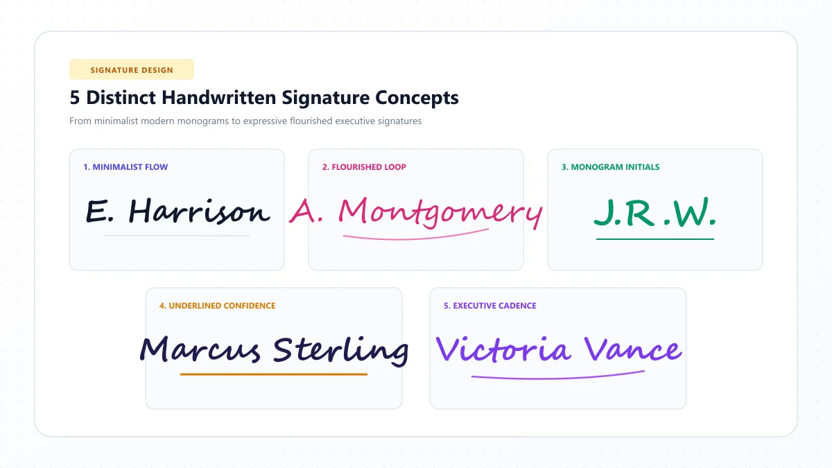
Modern everyday cursive may be more flexible, especially when adults adapt handwriting to personal preferences.
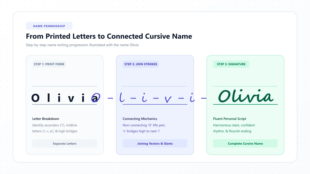
For example, someone might use a traditional looped lowercase g but choose a simpler, print-like uppercase G.
This personal style can be practical, provided the writing remains readable.
Is Modern Cursive Easier to Learn?
A simplified style may be approachable for people who find elaborate loops or traditional capitals difficult.
However, ease of learning depends on the specific letterforms and instructional approach.
A loosely defined style can also make learning harder if the student has no consistent model.
For beginners, it's usually better to follow one well-defined set of letterforms before experimenting with personalized variations.
Who Should Choose Modern Cursive?
Modern cursive may suit:
- Adults refreshing their handwriting.
- Students seeking a readable personal writing style.
- Journal writers.
- People who prefer fewer flourishes.
- Learners exploring simplified joined or italic handwriting.
Practice idea: Write the word minimum using a consistent simple cursive model. Remove unnecessary decorative strokes while keeping the letters recognizable and the joins comfortable.
D'Nealian vs. Zaner-Bloser: What's the Difference?
D'Nealian and Zaner-Bloser are often compared because both are established American handwriting programs.
Their largest practical difference concerns the relationship between manuscript writing and cursive.
Feature | D'Nealian | Zaner-Bloser |
|---|---|---|
Manuscript appearance | Generally slanted with connecting-style tails | Generally upright |
Transition philosophy | Build on manuscript movements when introducing cursive | Teach a more distinct cursive alphabet |
Lowercase entry strokes | Baseline lead-ins are characteristic | Some rounded lowercase forms begin differently |
Letter shapes | Closely related to its manuscript system | Traditional looped cursive forms |
Cursive slant | Forward slant | Forward slant |
Teaching approach | Continuous movement across print and cursive | Structured manuscript and cursive instruction |
Appropriate choice | Learners following a D'Nealian program | Learners following a Zaner-Bloser program |
Some differences are subtle and need to be checked against actual published letter models.
For example, the two curricula may differ in how lowercase letters begin, how long exit strokes extend, and how specific capitals connect.
These differences are easier to understand when comparing authentic teaching samples rather than decorative fonts labeled with the curriculum names.
Is One Better Than the Other?
There is no universally superior choice.
D'Nealian was designed to provide continuity between manuscript and cursive writing.
Zaner-Bloser provides a traditional, structured approach with upright manuscript and a distinct cursive alphabet.
The better fit often depends on the child's existing handwriting instruction, the quality of teaching, and the resources available.
If a child is already progressing well with one method at school, switching programs solely because another style looks more attractive may create unnecessary confusion.
Spencerian vs. Modern Cursive: Which Is More Practical?
Spencerian and contemporary simplified cursive serve somewhat different interests.
Spencerian appeals to people who value historical forms, elegant proportions, and traditional ornamental penmanship.
Modern cursive often emphasizes readable writing that fits naturally into daily life.
Feature | Spencerian | Modern cursive |
|---|---|---|
Appearance | Historical, graceful, often elaborate | Generally simpler and more personal |
Letter proportions | Structured oval-based proportions | Varies with the chosen style |
Flourishes | Common in ornamental applications | Usually optional or minimal |
Learning materials | Historical copybooks and penmanship courses | School guides, italic models, and handwriting resources |
Everyday notes | Possible with a practical Spencerian hand | Often a natural fit |
Decorative writing | Strong historical tradition | Depends on the chosen style |
Main challenge | Precise traditional forms | Maintaining consistency without a formal model |
Neither is inherently better.
Choose the style based on what you want to write and how much attention you want to devote to historical accuracy or decoration.
Other Cursive Handwriting Styles Worth Knowing
The four styles above are only part of a much wider handwriting tradition.
Several additional approaches help explain how cursive has evolved.
The Palmer Method
The Palmer Method was developed by Austin Norman Palmer around the end of the nineteenth century.
It emphasized rhythmic writing movement and a practical business hand, with less emphasis on ornament than highly decorative penmanship.
Palmer's approach became influential in American handwriting instruction.
It remains an important historical reference for people studying traditional school cursive.
Getty-Dubay Italic Handwriting
Getty-Dubay Italic offers an alternative to traditional loop-heavy cursive.
Its letterforms draw on italic handwriting traditions and emphasize clear, slanted shapes.
Learners can begin with separate italic letters and later develop joining movements.
It can appeal to people who prefer a simpler appearance with fewer traditional loops.
Handwriting Without Tears / Learning Without Tears
Learning Without Tears is another established handwriting education approach.
Its handwriting programs emphasize structured instruction, developmentally appropriate activities, and accessible letter formation.
The program has its own educational methodology rather than being simply another decorative cursive font.
Copperplate Script
Copperplate, often associated with English Roundhand traditions, is recognized for carefully constructed letterforms and pronounced thick-and-thin stroke contrast.
It is closely associated with pointed-pen calligraphy.
Although Copperplate and Spencerian share some visual features, they are not identical systems.
Copperplate is generally more formal in appearance, while Spencerian has its own distinctive movement patterns and proportions.
How to Identify Different Cursive Writing Styles
If you find an unfamiliar handwriting sample, look at several characteristics before trying to identify its style.
1. Examine the letter slant
Are the letters upright, gently slanted, or strongly leaning forward?
Slant alone cannot identify a system, but it provides a useful starting clue.
2. Look at the loops
Notice the ascending forms in letters such as b, f, and l.
Are the loops prominent, narrow, simplified, or absent?
3. Study the letter connections
Do most lowercase letters connect?
Are the entry and exit strokes long or short?
Do certain letters connect high near the middle writing line?
4. Compare capital letters
Capital letters can be more distinctive than lowercase forms.
Look especially at G, I, Q, S, and Z.
However, remember that individuals often modify capitals when developing a personal handwriting style.
5. Check stroke contrast
Are the strokes approximately uniform in thickness?
Or are there obvious thin upstrokes and thicker shaded downstrokes?
Strong contrast may suggest calligraphic penmanship, but the pen and writing technique matter as well as the underlying style.
6. Consider the source
A school workbook, historical copybook, wedding invitation, or personal notebook provides context.
For accurate identification, compare the sample with authentic instructional charts or historically documented examples.
A computer font that resembles an old penmanship style isn't necessarily an exact reproduction of that method.
Which Cursive Writing Style Is Easiest to Learn?
There is no one cursive style that is easiest for every learner.
However, different approaches may be more suitable depending on prior experience and learning goals.
Your situation | A sensible starting point |
|---|---|
Child already learning D'Nealian at school | Continue with D'Nealian |
Child learning Zaner-Bloser | Use matching Zaner-Bloser lessons |
Adult seeking readable handwriting | A consistent simplified cursive or italic model |
Beginner interested in historical lettering | Start with basic Spencerian forms |
Person interested in elegant calligraphy | Explore Spencerian or Copperplate |
Student struggling with mixed letter models | Choose one consistent instructional system |
For most school-age learners, maintaining consistency with the curriculum already in use is more useful than switching repeatedly between handwriting styles.
For independent adult learners, the most important starting point is choosing a model that is readable, comfortable, and realistic to practice.
How to Choose the Right Cursive Style for You
Before choosing a method, ask yourself three questions.
What will I use cursive for?
If you're learning for school, follow your educational program.
If you're writing personal letters or journal entries, readability and comfort may matter most.
If you're interested in historical penmanship, Spencerian may be more appealing.
How much time do I want to spend practicing?
A structured school handwriting program provides an organized path for beginners.
Learning elaborate historical capitals and pointed-pen shading generally involves additional techniques.
Choose a learning commitment that matches your goals.
Do I want handwriting or decorative digital text?
Physical cursive handwriting requires practice with pen movements.
Digital script text involves selecting or generating characters and typefaces.
You can enjoy both, but they aren't the same skill.
Our Cursive Text Generator offers copyable digital script styles.
For handwriting letter references, explore the Cursive Alphabet Chart and Cursive Letters Directory.
How to Practice Different Cursive Writing Styles
If you're exploring several styles, comparing the same word can help you notice what changes.
Choose a word such as:
hello
Then compare it in authentic D'Nealian, Zaner-Bloser, Spencerian, and simplified cursive examples.
Pay attention to:
- The shape of lowercase h.
- The size of the loops in l.
- The entry and exit strokes.
- The shape and joining position of o.
- Overall slant and proportions.
Exercise 1: Compare individual letters
Select the lowercase letters:
a, b, f, l, o, p, r, s
These provide opportunities to see differences in loops, entry movements, and distinctive forms.
Exercise 2: Compare words
Try:
hello, writing, beautiful, flower, lovely
Use authentic references for the style you're studying.
Exercise 3: Compare capitals
Write familiar names such as:
Alice, Grace, Isabella, Quinn, Sophia, Zoe
Notice how the capital letters differ from their printed equivalents and from one cursive system to another.
Exercise 4: Write a complete sentence
Use:
The quick brown fox jumps over the lazy dog.
Try the sentence in your selected method.
Focus on preserving the same style throughout rather than combining letterforms from several traditions.
Exercise 5: Choose your preferred style
After comparing genuine letter samples, select one style to practice consistently for a period of time.
Keep a dated handwriting sample so you can review progress.
Don't force your handwriting to look identical to a decorative font. Focus on the correct movements and proportions of the handwriting system you're learning.
Traditional Cursive vs. Modern Cursive Fonts
One common source of confusion is the difference between handwritten cursive styles and digital script fonts.
A cursive handwriting method describes how a person forms letters on paper.
A digital font controls how characters appear on a screen or printed document.
For example, a font may imitate Spencerian penmanship by using elongated loops and elegant capitals.
But selecting that font doesn't teach the actual pen movements used to write Spencerian letters.
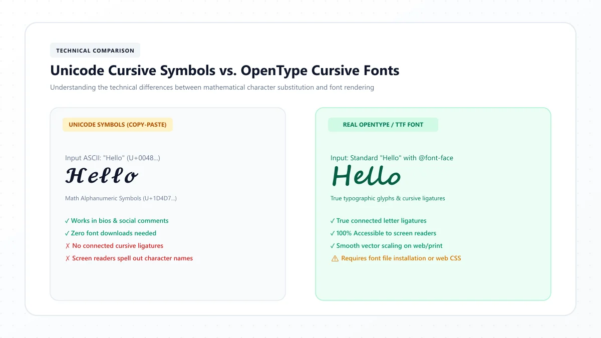
Similarly, a cursive text generator may display Unicode mathematical script characters such as 𝒜, 𝒷, and 𝒸.
These characters can be useful for decorative text, but they are not accurate teaching charts for D'Nealian, Zaner-Bloser, or Spencerian handwriting.
When to use each
Goal | Best resource |
|---|---|
Learn a school handwriting method | Official method-specific instructional guide |
Improve penmanship | Handwriting exercises and consistent practice |
Study historical lettering | Authentic historical penmanship examples |
Create social media script text | Cursive text generator |
Explore decorative typefaces | Script font previews |
Learn how letters connect physically | Stroke demonstrations and letter-joining lessons |
Use the resource that actually teaches or creates what you need.
Common Mistakes When Comparing Cursive Styles
Assuming every cursive style has the same alphabet
Some lowercase forms are similar across methods, but other letters and capitals differ considerably.
Always compare actual instructional models.
Believing one method is best for everyone
Personal comfort, educational context, and learning goals matter more than choosing a style solely because it looks elegant.
Switching styles during early practice
Mixing unrelated letterforms can introduce confusion.
Choose one approach before developing a personalized style.
Treating Spencerian as only decorative lettering
Spencerian has a rich history as a complete handwriting system, not just a collection of elaborate capital flourishes.
Mistaking decorative Unicode for handwriting instruction
Unicode script characters represent digital symbols, not physical stroke sequences.
Focusing only on appearance
Letter proportions, movement, consistency, and readability are just as important as whether a particular style looks attractive.
Frequently Asked Questions About Cursive Writing Styles
What are the different types of cursive writing?
Common styles include D'Nealian, Zaner-Bloser, the Palmer Method, Spencerian penmanship, italic handwriting, and various modern simplified cursive approaches. Different countries also use their own school handwriting traditions.
What is the difference between D'Nealian and Zaner-Bloser cursive?
D'Nealian uses manuscript letterforms designed to support a gradual transition into cursive. Zaner-Bloser traditionally teaches upright manuscript followed by a more distinct cursive alphabet. Both are structured handwriting programs.
Is Spencerian the same as modern cursive?
No. Spencerian is a specific historical American penmanship system with characteristic proportions and flowing forms. Modern cursive is a broad description of contemporary handwriting approaches.
Which cursive writing style is best for beginners?
A consistent, clearly demonstrated handwriting method is usually the best starting point. Children should generally follow their school's instructional model. Adults can select an accessible, readable script that fits their goals.
Which cursive style looks the most elegant?
This is a matter of preference. Spencerian is particularly admired for graceful historical forms and ornamental capitals, while simplified modern cursive can also look elegant through balanced spacing and smooth letter movement.
Is D'Nealian easier than Zaner-Bloser?
D'Nealian was designed to make the transition between manuscript and cursive more continuous. However, that does not prove it is easier for every student. Both programs require appropriate instruction and practice.
Can I learn Spencerian with a regular pen?
You can practice basic letter shapes and movements using an ordinary pen or pencil. To reproduce the distinctive shaded strokes of ornamental Spencerian, a suitable pointed pen and specialized technique are typically used.
Is the Palmer Method still cursive?
Yes. The Palmer Method is a historical American cursive penmanship system emphasizing practical, rhythmic writing movement with less ornamentation than some earlier traditions.
Are cursive fonts and cursive handwriting styles the same?
No. A font is a digital or typographic design, while a handwriting method explains how a person physically forms letters. A font may imitate a handwriting tradition without reproducing its exact stroke rules.
Can I combine different cursive writing styles?
Once you understand a consistent writing system, you can develop personal variations. Beginners should generally avoid mixing incompatible instructional letterforms before mastering their basic movements.
How many cursive writing styles exist?
There is no single official count. Multiple named penmanship systems exist, along with regional school methods, historical scripts, and countless personal handwriting variations.
Final Thoughts: Find a Cursive Style That Fits Your Goals
Cursive writing has never been limited to one set of letter shapes.
D'Nealian focuses on continuity between manuscript and cursive. Zaner-Bloser offers a traditional school handwriting approach. Spencerian preserves a graceful historical penmanship tradition. Modern cursive provides room for simplified, personal writing styles.
Each approach has a different purpose and learning experience.
If you're choosing cursive for school, begin with the method your curriculum uses. If you're learning independently, consider the kind of writing you want to do and how much time you want to spend practicing.
Whatever style you choose, consistent letterforms, comfortable movements, and readable writing matter more than elaborate decoration.
To continue exploring handwriting, visit our Cursive Alphabet Chart, browse the Cursive Letters Directory, or experiment with decorative digital lettering using our Cursive Text Generator.
References and further reading
- Encyclopaedia Britannica — Cursive handwriting
- Encyclopaedia Britannica — Palmer Method
- The Palmer Method — historical Palmer Method lessons archive
These links are provided for further reading. External websites and information may change.