Have you ever watched someone write in cursive and wondered how they make every letter flow so smoothly into the next? Those elegant loops and connected strokes can look difficult at first, especially if you've spent most of your life writing in print.
The good news is that cursive handwriting is a skill you can learn one small movement at a time. You don't need expensive pens, artistic talent, or perfect handwriting to get started. A sheet of lined paper, a comfortable pen, and a little patience are enough.
In this beginner-friendly guide, you'll learn how to write in cursive step by step, from basic strokes and lowercase letters to capitals, letter connections, and complete sentences. You'll also find an A–Z reference, common mistakes to avoid, and a simple seven-day practice plan.
How to Write in Cursive: The Quick Answer
To write in cursive, start by learning the basic curved strokes used to form letters. Practice lowercase letters with similar shapes, learn how their entry and exit strokes connect, and gradually move from individual letters to short words and sentences.
Here's a simple way to begin:
- Prepare lined paper and a pen that moves comfortably.
- Practice upward curves, downward curves, ovals, and loops.
- Start with easy lowercase letters such as i, u, t, and l.
- Move on to rounded letters such as a, c, d, and o.
- Join two or three letters to make simple words.
- Practice capital letters and full sentences.
- Write slowly until your letter shapes become consistent.
Beginner tip: Focus on making your writing readable before trying to make it fast or decorative. A smooth, recognizable letter is more useful than a complicated flourish.
What Is Cursive Writing?
Cursive writing is a style of handwriting in which letters are often connected through flowing strokes. Instead of drawing each character separately, as you normally would with print handwriting, you create a continuous rhythm across the word.
Consider writing the word minimum. In print, you might lift your pen between every letter. In many cursive styles, the lowercase letters connect through a series of upward curves and loops, allowing you to keep writing with fewer interruptions.
Not every cursive letter or style uses exactly the same connections. Some capital letters begin separately, and certain lowercase letters require a pen lift or an additional stroke. The goal is controlled, flowing handwriting, not keeping the pen on the paper at all costs.
Cursive vs. Print Handwriting
Feature | Print handwriting | Cursive handwriting |
|---|---|---|
Letter formation | Usually separate characters | Many letters connect |
Movement | More frequent starts and stops | More flowing transitions |
Letter shapes | Similar to printed type | Often include loops and entry strokes |
Beginner challenge | Learning individual shapes | Learning shapes and joins |
Common uses | Forms, notes, labels | Notes, personal letters, signatures |
Both styles are useful. Cursive simply gives you another way to express yourself through handwriting.
What Do You Need to Start Writing in Cursive?
You can practice cursive with everyday writing supplies. A comfortable setup makes it easier to focus on your strokes instead of struggling with the pen or paper.
Choose a comfortable pen or pencil
A regular pencil, ballpoint pen, or smooth-writing gel pen works well for beginners. Choose one that doesn't require excessive pressure.
Avoid starting with a difficult-to-control calligraphy nib. Decorative lettering tools can be enjoyable later, but ordinary handwriting is easier to learn with familiar supplies.
Use lined paper
Wide-ruled or handwriting practice paper provides visual guides for keeping letters consistent.
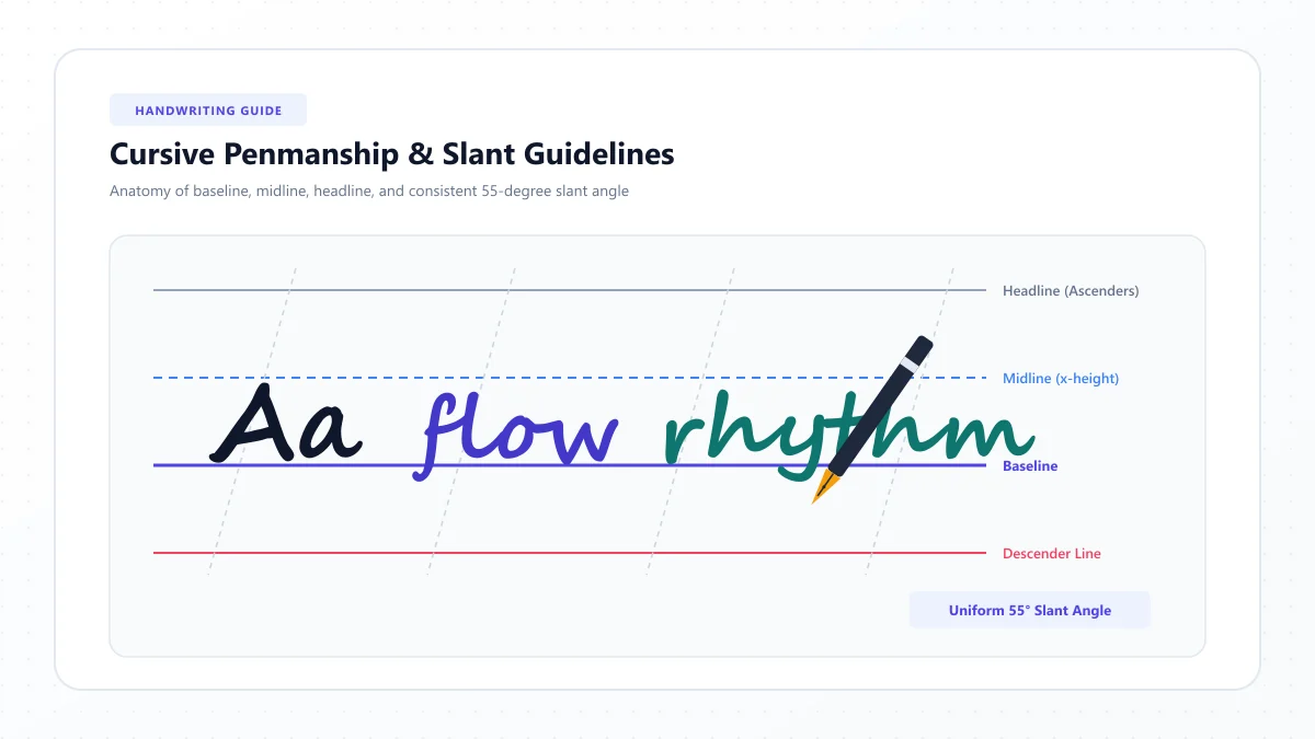
Think of a writing line as having four reference points:
- Top line: The approximate upper limit for tall letters.
- Middle line: The usual height of short lowercase letters.
- Baseline: The line on which most letters rest.
- Descender line: The space below the baseline for letters with tails.
For example, lowercase a and o generally stay within the middle writing zone. Lowercase h extends upward, while g and y extend below the baseline.
Find a comfortable writing position
Sit comfortably with your feet supported and shoulders relaxed. Keep the paper at an angle that allows your hand to move naturally.
You don't need to force your notebook to a particular angle. Right-handed and left-handed writers may find different positions more comfortable.
Hold the pen gently enough to allow smooth movements. If your fingers become tense or tired, take a short break.
Step 1: Learn the Basic Cursive Strokes
Before trying the full alphabet, practice the small movements that appear repeatedly in cursive handwriting.
These are the building blocks of connected letters.
1. Undercurve
An undercurve moves upward, rounds over, and returns toward the baseline. It appears in letters such as i, u, and parts of m.
Try writing a row of gentle, evenly spaced upward curves. Keep the tops at approximately the same height.
2. Overcurve
An overcurve rises into a rounded arch before returning downward. Similar movements appear in letters such as r and s.
Practice making the arches smooth rather than pointed.
3. Oval
Ovals form the foundation of letters such as a, d, g, o, and q.
Start with a slightly slanted oval. Practice closing the shape neatly without making it too narrow or too wide.
4. Ascending loop
An ascending loop reaches above the middle line and returns toward the baseline. It is common in looped versions of b, f, h, and l.
Begin with a small loop. Keep enough space inside it so the letter remains recognizable.
5. Descending loop
A descending loop travels below the baseline before returning upward. You'll see this movement in letters such as g, j, y, and some versions of p.
The descending loop should remain proportional to the rest of the letter.
Practice exercise: Draw one line of undercurves, one line of overcurves, one line of ovals, and one line each of ascending and descending loops. Don't worry about speed. Concentrate on making each repetition similar to the one before it.
Step 2: Learn Lowercase Cursive Letters First
Lowercase letters are a practical starting point because they make up most of the words you'll write.
Rather than memorizing the alphabet in order, begin with groups of letters that share movements.
Group 1: Simple curve letters
Start with:
i, u, t, w
These letters introduce short upward and downward movements. Lowercase i and t also teach you to add finishing details after writing the main word.
Practice these sequences:
- ii, uu, tt, ww
- it, ti, ui, wi
- wit, twit
Group 2: Rounded and oval letters
Next, practice:
a, c, d, g, o, q
These letters share rounded forms. Once you can make a consistent oval, you'll recognize the same motion in several different characters.
Practice:
- aa, cc, oo
- ca, co, da
- dad, good, cocoa
Pay close attention to where each letter closes and where its exit stroke begins.
Group 3: Loop letters
Now try:
b, f, h, k, l
These introduce taller strokes and loops.
Start with lowercase l. Make an upward loop, return to the baseline, and finish with a gentle exit curve.
Move on to h and b, which add new movements after the tall stroke.
Practice:
- ll, hh, bb
- hill, bill, half
- bike, like, hello
Group 4: Arch and bridge letters
Practice:
m, n, r, v, x
These letters help you control rounded arches, shoulders, and changes in direction.
Keep the humps of m and n evenly sized. Make sure r looks different from n when you connect it to another letter.
Practice:
- mm, nn, rr
- run, mine, river
- mix, move
Group 5: Remaining lowercase letters
Finish with:
e, j, p, s, y, z
This group includes different letter structures, so learn them individually rather than expecting one identical movement.
For example, j and y introduce tails below the writing line, while z may require a more controlled turn.
Practice:
- see, yes, joy
- puppy, zipper, easy
Once you can recognize and write each lowercase letter, begin combining the groups into words.
Step 3: Learn the Cursive Alphabet A–Z
The English cursive alphabet contains 26 lowercase and 26 uppercase letters. Although the overall alphabet stays the same, handwritten forms can vary between school methods and writing styles.
The reference below gives you a simple starting point for each lowercase letter. It is not a substitute for a demonstrated stroke diagram, because a static letter shape cannot show pen direction or stroke order.
Letter | Beginner writing tip | Practice word |
|---|---|---|
A / a | Form a rounded oval and finish with an upward exit stroke. | apple |
B / b | Make a tall loop and add a rounded lower section. | baby |
C / c | Draw an open curve with a gentle entry and exit. | cat |
D / d | Form an oval, then extend the tall ascending stroke. | day |
E / e | Make a small, open loop that stays easy to read. | easy |
F / f | Practice the tall stroke carefully; the lower loop varies by style. | fish |
G / g | Make an oval and extend a loop below the baseline. | garden |
H / h | Begin with a tall loop, then create a rounded hump. | happy |
I / i | Make a short upward curve and add the dot afterward. | idea |
J / j | Sweep below the baseline and add the dot after the word. | jump |
K / k | Start with a tall stroke and form a small upper loop or arm. | kind |
L / l | Make a tall ascending loop and return to the baseline. | love |
M / m | Form repeated, balanced rounded humps. | moon |
N / n | Use controlled arches with a smooth exit. | nice |
O / o | Create a rounded oval with a high exit connection. | open |
P / p | Extend the main stroke below the baseline and form the upper body. | paper |
Q / q | Make an oval and add a descending stroke or loop. | queen |
R / r | Form a small shoulder that stays distinct from n. | rain |
S / s | Practice a controlled curved movement with a clear finish. | sun |
T / t | Make a tall, narrow stroke and add its crossbar afterward. | tree |
U / u | Form two smooth undercurves with consistent height. | under |
V / v | Shape the lower turn clearly and finish with its exit stroke. | very |
W / w | Build a series of even undercurves. | water |
X / x | Use the appropriate crossing or connected shape for your style. | box |
Y / y | Form the upper body and carry the tail below the baseline. | yellow |
Z / z | Learn the particular looped or simplified form used in your style. | zebra |
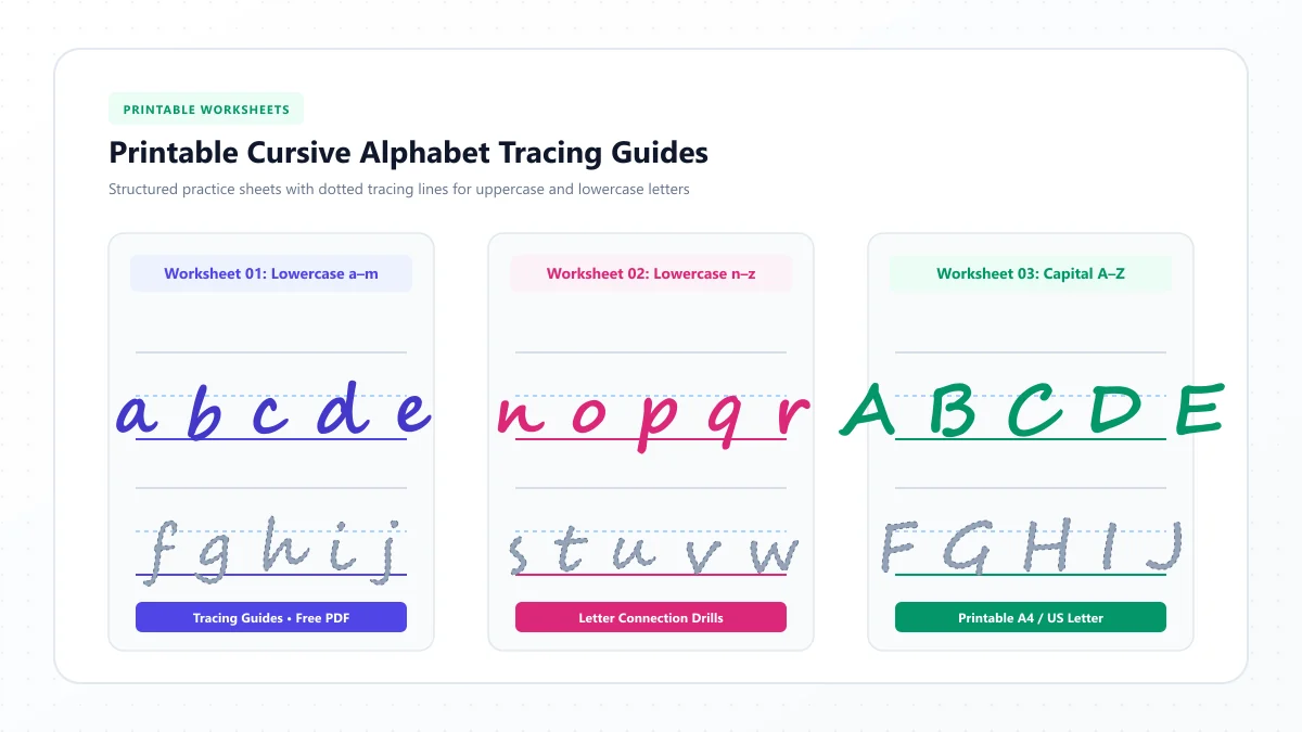
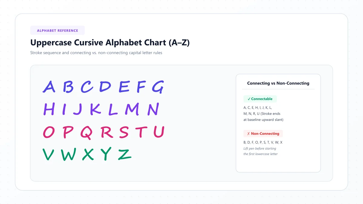
For visual examples of all 26 uppercase and lowercase forms, use our Cursive Alphabet Chart. You can also visit the Cursive Letters Directory for individual letter guides.
How to practice the alphabet effectively
Don't attempt to master all 52 uppercase and lowercase forms in one session.
Instead, choose four or five letters, practice each one several times, and then use those letters in short words.
Check three things as you write:
- Does the letter have a recognizable shape?
- Does it stay within the correct writing zone?
- Does the ending stroke lead naturally toward the next letter when a connection is appropriate?
If you struggle with a specific letter, return to the basic movement that creates it.
Step 4: Learn Uppercase Cursive Letters
Capital cursive letters often look more decorative than lowercase letters, but they don't have to be complicated.
Begin with letters that feel familiar, such as A, C, E, L, and O. Then work toward shapes that differ more noticeably from their printed forms.
Some traditional uppercase letters, including G, Q, and Z, can look quite different from modern printed capitals. Their exact shapes depend on the handwriting method you're learning.
Tips for writing capital letters
- Practice the capital letter on its own before adding a word.
- Keep the main shape readable rather than adding extra flourishes.
- Use the same general slant as your lowercase writing.
- Don't force a capital-to-lowercase connection if your chosen style begins the first lowercase letter separately.
- Practice the letter within a real name or sentence.
Try these examples:
A — Anna, April, Alice
C — Clara, Charlie, Canada
L — Lily, Lucas, London
M — Maya, Michael, Monday
S — Sarah, Samuel, Sunday
Start with familiar names. Once you can write a capital and the following lowercase letters comfortably, move on to longer words.
For more detailed stroke instructions, explore the individual letter pages in our A–Z Cursive Letter Directory.
Step 5: Learn How to Connect Cursive Letters
Writing individual cursive letters is only part of the process. The next challenge is joining them into readable words.
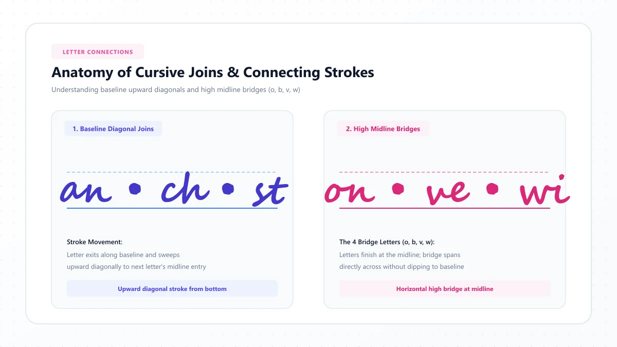
Most lowercase connections depend on the ending position of one letter and the starting movement of the next.
Low connections
Many letters finish near the baseline and rise into the next letter through an upward connecting stroke.
For example, practice:
- in
- an
- it
- un
Try to make the connecting stroke part of the movement rather than adding it as a separate line.
High connections
Some letters, including many cursive versions of o, v, and w, finish higher on the writing line.
Their connections may therefore look different from the joins after letters such as i or u.
Try:
- on
- oven
- own
Slow down when the exit point changes. This is where beginners often create awkward gaps or crowded shapes.
When should you lift your pen?
Cursive doesn't mean the pen must never leave the page.
You'll generally lift your pen to dot lowercase i and j, cross t, and complete certain forms or letter combinations.
A practical habit is to finish the main body of a word first, then return to add dots and crossbars. However, follow the sequence taught by your handwriting method if it differs.
Practice with short words
Start with:
- in
- on
- an
- it
- all
- moon
- rain
- love
- smile
Write each word slowly, concentrating on the transition between letters rather than their individual appearance alone.
When a connection feels awkward, separate the two letters, study their exit and entry strokes, and join them again.
Step 6: Write Your First Cursive Words
Once you're comfortable with several lowercase letters, start writing meaningful words.
Choose words that include familiar shapes before moving to more difficult combinations.
Easy three-letter words
Try writing:
- cat
- sun
- pen
- run
- day
- mom
- dad
- fun
- red
- sit
Write each word three times. Look at the connections between letters and notice whether your spacing stays consistent.
Four- and five-letter practice words
Move on to:
- love
- moon
- rain
- tree
- home
- smile
- apple
- hello
- happy
- water
These words include combinations of short letters, arches, ovals, and loops.
If your handwriting becomes difficult to read, slow down and increase the space between words.
Practice writing your name
Your own name is a great way to make cursive practice feel personal.
Start with the first letter. Practice its shape, then add the remaining letters one by one.
If your name contains a difficult connection, such as a rounded letter followed by a tall loop, practice that pair separately.
To explore the appearance of names in digital script styles, you can also use our Cursive Text Generator. Remember that digital script characters are visual references, not instructions for handwritten pen movement.
Step 7: Practice Complete Cursive Sentences
When short words begin to feel comfortable, use complete sentences to develop rhythm, spacing, and consistency.
Start with sentences that contain familiar letter combinations.
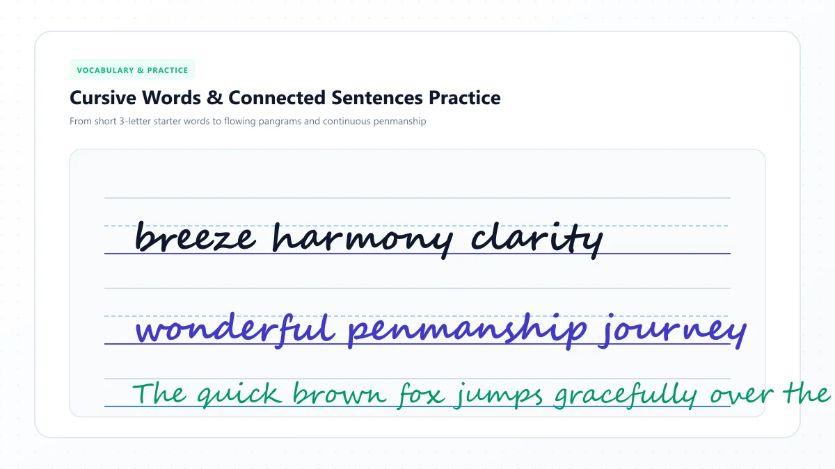
Easy cursive practice sentences
- The sun is bright today.
- I love to read books.
- My name is Anna.
- The little cat is sleeping.
- We went for a walk.
- I can write in cursive.
- Every day is a new beginning.
- The flowers bloom in spring.
- Practice makes writing easier.
- A kind word can make someone smile.
Try writing one sentence across an entire line. On the next line, write it again, concentrating on whichever part was difficult.
You can also practice with this sentence:
The quick brown fox jumps over the lazy dog.
It contains every letter of the English alphabet, making it useful for reviewing a broad range of letter shapes. However, it is better suited to learners who have already practiced the individual letters.
A Simple 7-Day Cursive Writing Practice Plan
You don't need to spend hours practicing. Short, focused sessions can help you build familiarity without making handwriting feel like a chore.
Here's a suggested seven-day beginner routine. It's a starting schedule, not a promise that everyone will master cursive in one week.
Day | Focus | Suggested practice |
|---|---|---|
Day 1 | Basic strokes | Curves, ovals, arches, and loops |
Day 2 | Simple lowercase letters | i, u, t, w, e |
Day 3 | Rounded letters | a, c, d, g, o, q |
Day 4 | Tall and descending letters | b, f, h, j, k, l, p, y, z |
Day 5 | Remaining letters and joins | m, n, r, s, v, x, then letter pairs |
Day 6 | Capitals and words | Your name, familiar words, and short phrases |
Day 7 | Sentences and review | Five sentences and your most difficult letters |
A 10-minute daily routine
For a short practice session, try:
Minutes 1–2: Warm up with simple curves and loops.
Minutes 3–5: Practice two or three individual letters.
Minutes 6–8: Write short words using those letters.
Minutes 9–10: Review your handwriting and choose one improvement for tomorrow.
Some learners will need more time on particular letters. That's completely normal. The purpose of the plan is to create a manageable routine, not to rush through the alphabet.
10 Common Cursive Writing Mistakes and How to Fix Them
Most beginners experience a few predictable problems when they first learn cursive.
Understanding them can make practice less frustrating.
1. Writing too quickly
Speed often makes new letterforms uneven.
Fix: Slow down until you can form each letter consistently. Increase your speed only when you no longer need to think about every movement.
2. Making inconsistent letter sizes
If a, e, and o have different heights, your writing may look uneven.
Fix: Use lined paper and keep short lowercase letters near the same height.
3. Closing loops too tightly
Small loops can become difficult to distinguish from straight lines.
Fix: Leave enough space inside the loops of letters such as l and e.
4. Using too much pressure
Pressing hard can make your writing movements stiff and tiring.
Fix: Relax your grip and choose a pen that writes smoothly.
5. Making letter connections too long
Large connections create unwanted gaps within words.
Fix: Keep joins compact and practice individual letter pairs.
6. Making ovals too narrow
Letters such as a and o can become difficult to recognize when their rounded shapes collapse.
Fix: Practice complete ovals separately before using them in words.
7. Forgetting dots and crossbars
Small details help distinguish letters.
Fix: Check for missing dots on i and j and missing crossbars on t after finishing a word.
8. Mixing incompatible letter styles
Different cursive methods use different letter shapes and connections.
Fix: Follow one basic handwriting model while you're learning. Explore decorative styles once the fundamentals feel comfortable.
9. Ignoring spacing
Even well-formed cursive letters can be hard to read when words run together.
Fix: Make the spaces between words noticeably larger than the spaces within connected words.
10. Comparing your handwriting to decorative calligraphy
Highly stylized lettering isn't always intended for everyday handwriting.
Fix: Build clear, comfortable handwriting first. Decorative flourishes can come later.
How to Make Your Cursive Handwriting Look Better
Once you can write complete words, focus on consistency rather than complexity.
Keep a comfortable slant
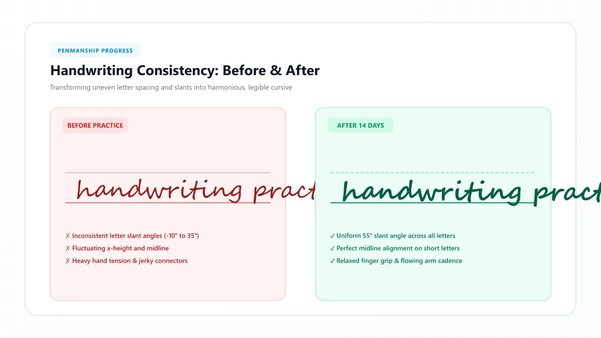
Many traditional cursive styles use a rightward slant, but the exact angle varies. Choose a comfortable, consistent slant that suits your writing hand and handwriting method.
Make your letter heights consistent
Compare letters within the same group. Short letters should appear similar in height, while tall letters should extend upward in a controlled way.
Practice rhythm
Try writing a short word several times without stopping to analyze every stroke. Aim for movements that feel smooth and repeatable.
Keep your writing readable
Beautiful handwriting isn't necessarily the handwriting with the most loops. Simple, balanced letterforms can look elegant and be easier for others to understand.
Review one improvement at a time
Instead of criticizing the entire page, identify one specific issue.
For example:
"My lowercase a is too narrow."
During your next practice session, focus on making the oval wider and more consistent.
Small, specific adjustments are easier to apply than trying to fix everything at once.
How Long Does It Take to Learn Cursive?
There isn't a fixed timeline for learning cursive.
Some beginners become comfortable with individual letters quickly but need more time to connect words smoothly. Others already know the basics and simply want to improve their handwriting.
Progress depends on factors such as prior handwriting experience, practice frequency, the cursive style being learned, and personal comfort with fine motor movements.
Rather than setting an unrealistic deadline, look for measurable improvements:
- Can you recognize and write most lowercase letters without checking a chart?
- Can you connect familiar letter pairs?
- Can you write a short word without stopping after every character?
- Can someone else read your handwriting comfortably?
Once those skills improve, you're making meaningful progress.
Is Cursive Writing Hard for Beginners?
Cursive can seem difficult because it asks you to learn both letter shapes and the movements between letters.
However, many letters share similar curves, arches, and loops. Practicing those common movements reduces the number of completely new shapes you need to learn.
The most helpful approach is to divide the process into manageable tasks. Learn a few letters, connect them into words, and gradually expand what you can write.
For children or adults who experience persistent discomfort or significant handwriting difficulties, a teacher or qualified occupational therapist may be able to recommend appropriate support.
Can You Learn Cursive Writing Online?
Yes. Online letter guides, writing demonstrations, and printable practice sheets can help you understand cursive letterforms and practice at your own pace.
The most useful resources show how a letter is formed, where the pen begins, which direction each stroke follows, and how the letter connects to others.
A static picture of a cursive letter is helpful for recognizing its appearance, but it cannot fully teach stroke order. That's why you should combine visual references with guided handwriting practice.
You can explore the Cursive Alphabet Chart to compare letterforms and then open individual guides from the Cursive Letters Directory when you need help with specific characters.
If your goal is to create decorative text for a profile, invitation, or digital project rather than learn handwriting, the Cursive Text Generator provides copyable script-style characters.
These are related activities, but they aren't exactly the same thing. A digital cursive font displays letters; practicing cursive handwriting teaches you how to draw them yourself.
Frequently Asked Questions
What is the easiest way to learn cursive writing?
Start with basic curves and loops, then practice simple lowercase letters such as i, u, t, and l. Add rounded letters, learn the remaining alphabet, and begin joining letters into short words. Practice consistently and focus on readable shapes.
Should beginners learn uppercase or lowercase cursive first?
Lowercase letters are usually a practical starting point because they appear most frequently in ordinary words and introduce the connections used in cursive handwriting. You can add uppercase letters once you're comfortable with the basics.
Can adults learn cursive writing?
Absolutely. Adults can learn cursive handwriting by practicing the same letter shapes, strokes, and connections used in beginner lessons. Familiarity with printed handwriting can also help when recognizing letters.
Do all cursive letters have to connect?
No. Connection rules depend on the writing style and the specific letters involved. Some capitals are separate from the rest of the word, and dots, crossbars, or other details require additional pen movements.
Which cursive letters are hardest to learn?
Difficulty varies by learner. Some people find looped lowercase letters such as b, f, and z challenging, while others struggle with distinctive capital letters such as G, Q, and Z. Practice the shapes that give you the most trouble rather than repeating the entire alphabet equally.
Is cursive faster than print handwriting?
Connected cursive can involve fewer pen lifts, which may support fluent handwriting once the movements are familiar. However, cursive isn't automatically faster for everyone. Speed depends on the writer, the style, and the amount of practice.
Is cursive the same as calligraphy?
No. Cursive is a style of connected or flowing handwriting. Calligraphy focuses on the deliberate visual design of letters and may use specialized tools, stroke contrast, and decorative techniques. Some lettering styles combine features of both.
Can I learn cursive without special worksheets?
Yes. You can use ordinary lined paper and a reliable letter reference. Handwriting worksheets can provide extra guidance, but they aren't essential for getting started.
Final Thoughts: Start Small and Keep Practicing
Learning how to write in cursive doesn't require perfect handwriting on your first attempt. It starts with simple movements, familiar letter shapes, and the willingness to practice a little at a time.
Begin with lowercase letters, build comfortable connections, and gradually work toward words and complete sentences. Keep your writing clear, allow yourself time to improve, and don't feel pressured to imitate elaborate calligraphy.
Most importantly, make cursive practice enjoyable. Write a friend's name, a favorite quote, or a short note. The more meaningful your practice feels, the easier it becomes to make it part of your routine.
Ready to explore more cursive letters? Visit our A–Z Cursive Alphabet Chart, browse the individual letter guides, or experiment with decorative digital lettering using the Cursive Text Generator.
References and further reading
- Reading Rockets — The Importance of Teaching Handwriting
- Encyclopaedia Britannica — Cursive handwriting
These links are provided for further reading. External websites and information may change.